Data Report Clean-Up
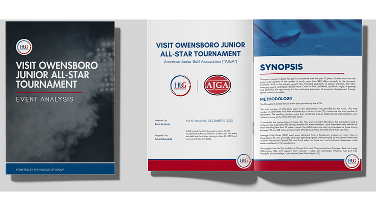
The Huddle Up Group works with communities across the United States to improve their sports tourism efforts. The client asked for an updated Event Analysis report that was less text-focused and included more data visualizations.
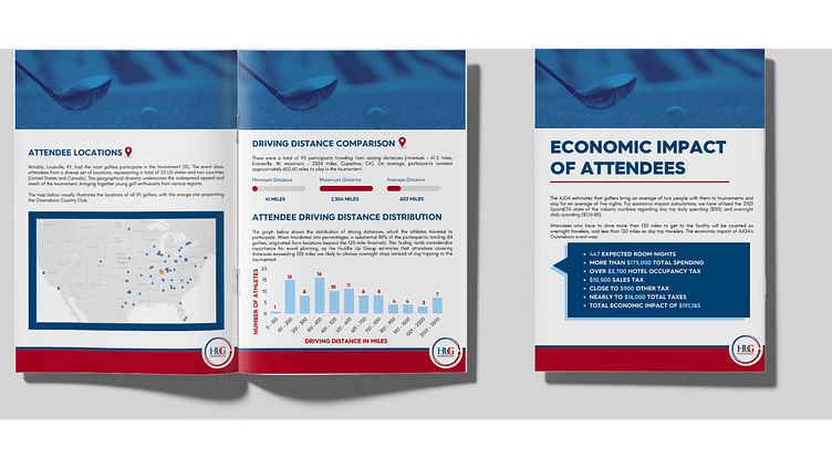
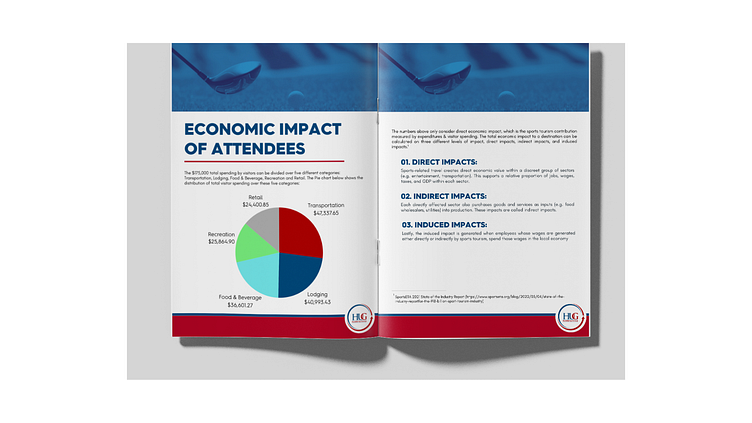
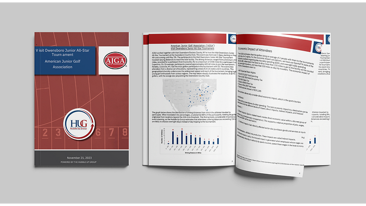
The reports are data-heavy, but chock-full of important statistics and information for the sports event organizers to be able to understand and utilize. My goal as the designer was to find a way to simplify the presentation of information so that it was not visually overwhelming.
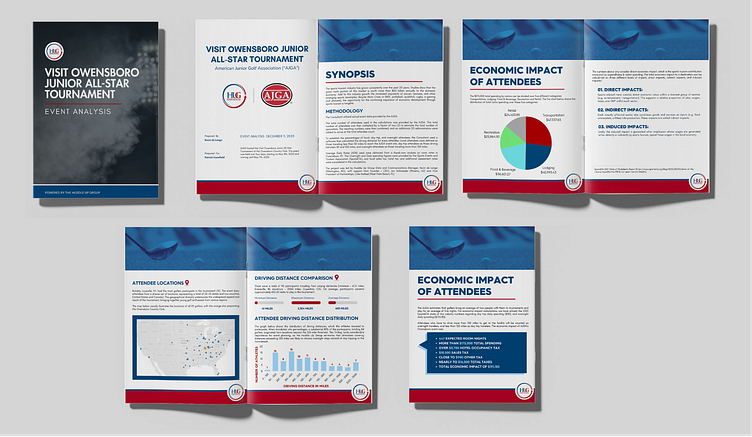
The Before image on the next page is the reference I was given for the existing report. The After image is what I turned that same report into. I broke up a lot of the large paragraphs of takeaway text and turned them into scannable and eye-catching charts and graphs. I wanted the overall feel of the report to be more professional and modern than the previous report.
This was the first updated report that Huddle Up Group has had and both them and their client were incredibly happy with the outcome. The client said that the report was “very digestible,” due to the data visualizations, which was my goal. I really enjoy using design to get crucial information across to viewers in a visually engaging and informative manner.
BEFORE
AFTER