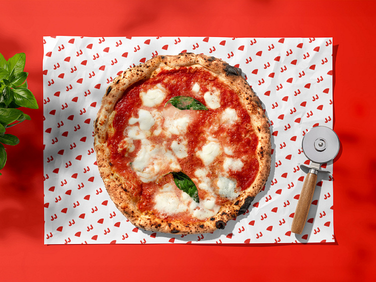
jj pizza redesign
Rediscovering the Brand: The Evolution in JJ Pizza’s Design 🍕
⌛ In 2019, the #ThirtyLogosChallenge inspired me to create a logo a day, and now, with 5 years of experience, I decided to revisit this project. It’s a personal challenge I undertake regularly: to redo past designs with the knowledge I’ve accumulated.
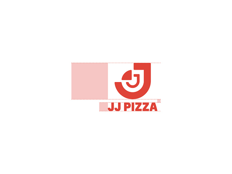
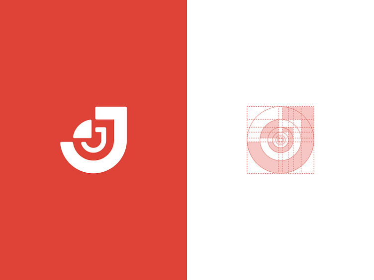
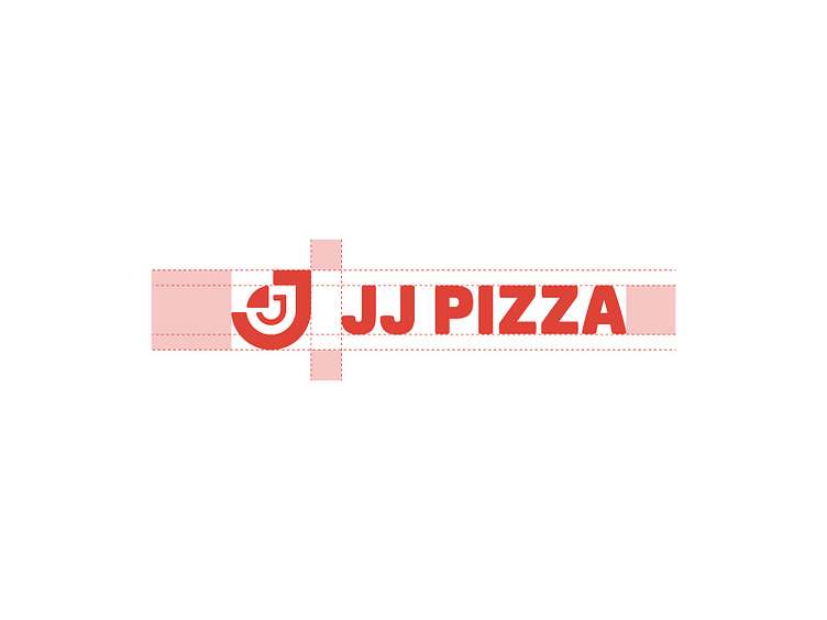
🎯 The result? The redesign of the JJ Pizza logo, where the vibrant red color #DF4337 joins the precision of the golden ratio for a modern and sophisticated style.
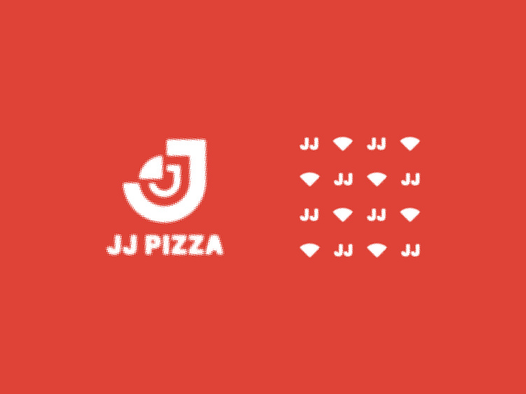
✨ The renewal is complete with half-tone textures, giving the brand a unique visual standard. This review exercise is proof of my evolution in my career.
🔍 Tip for new designers: Engaging in challenges like the #ThirtyLogos is an excellent strategy to enrich your portfolio and catch the eyes of advertising agencies. That’s how I secured my first job in the field!
🔄 Check out the last screen for a comparison between the original 2019 logo and the 2024 redesign. Which one is your favorite? Share your opinion, and let’s discuss the constant evolution in design!
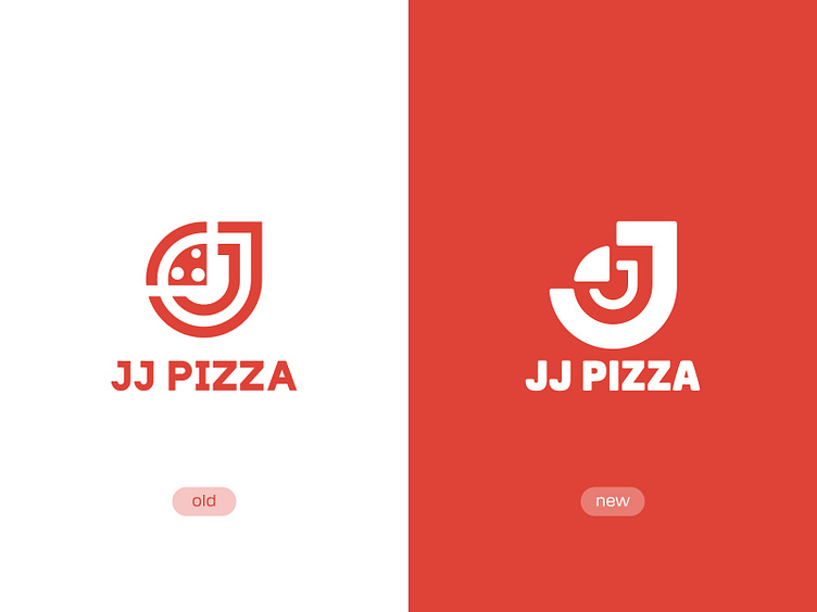
Which one is your favorite? Share your opinion, and let’s discuss the constant evolution in design!