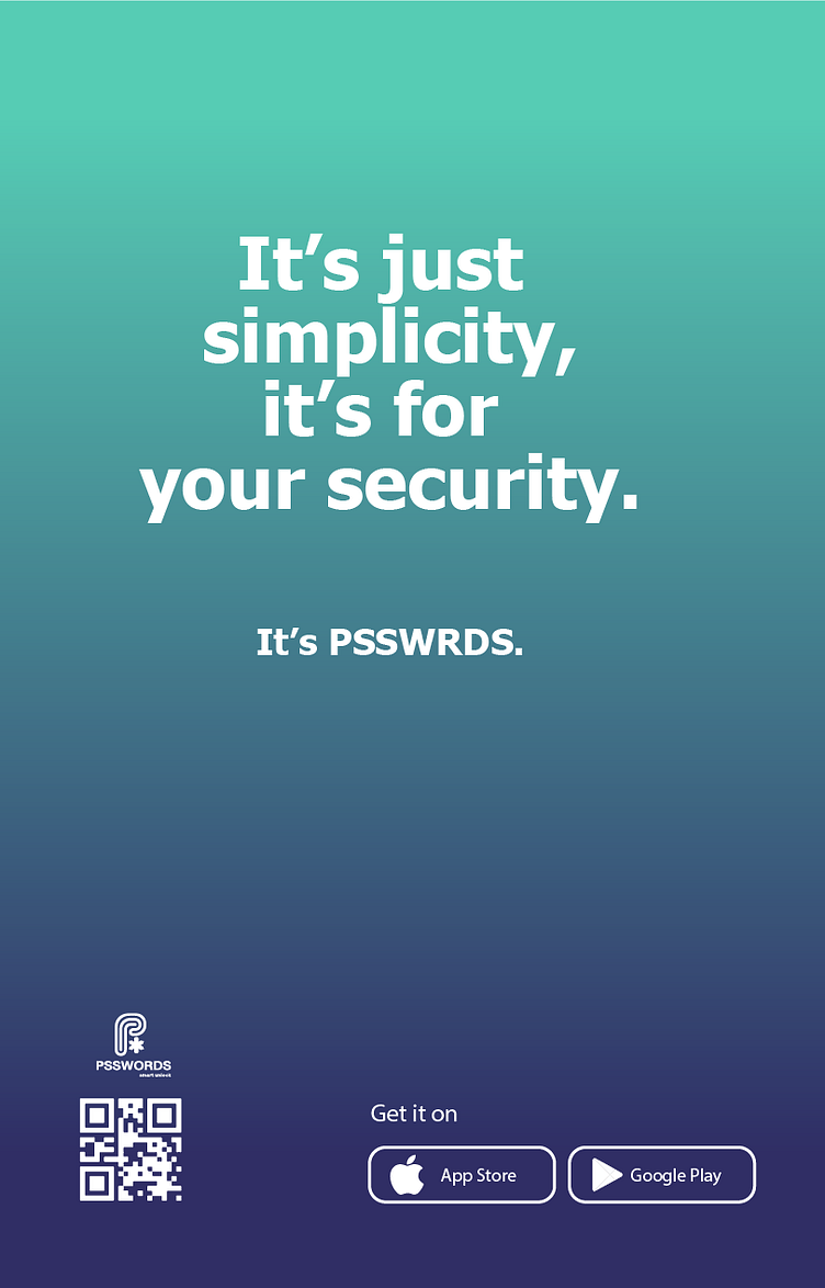
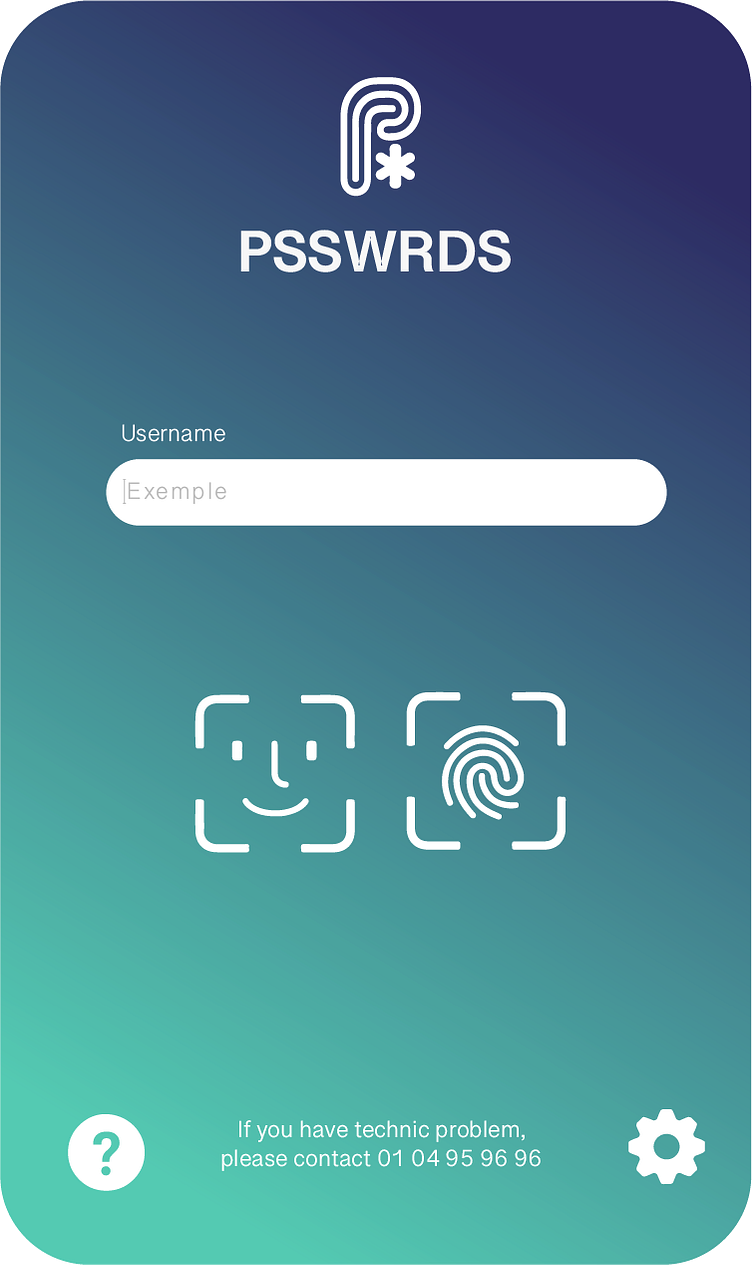
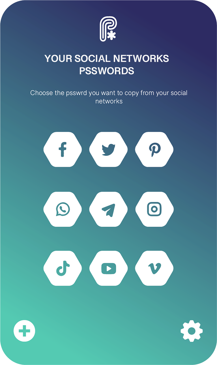
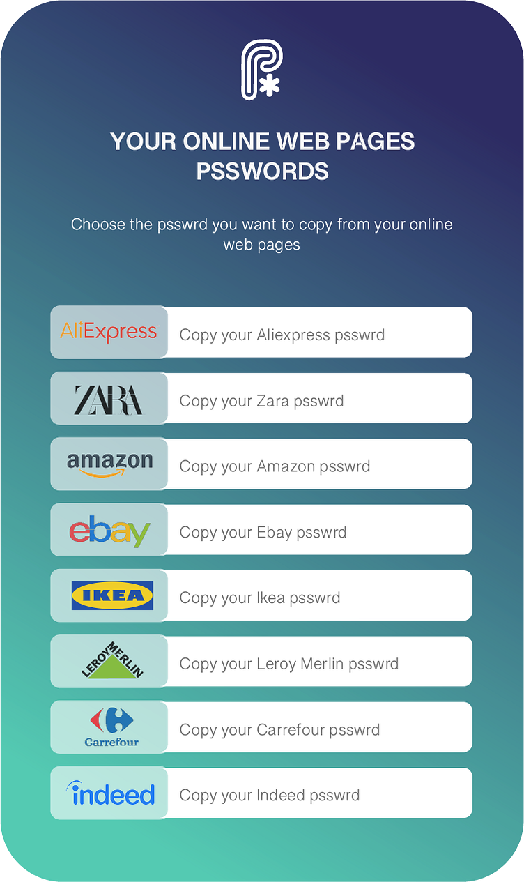
Security in Simplicity: PSSWRDS' App Logo
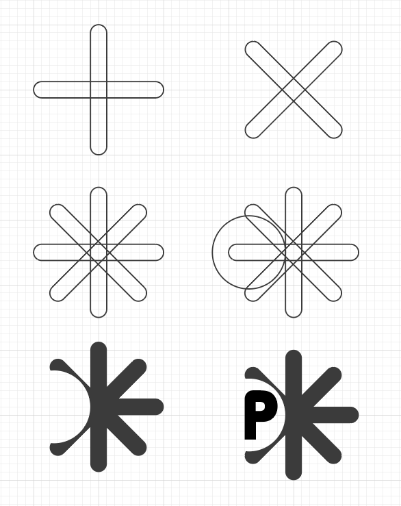
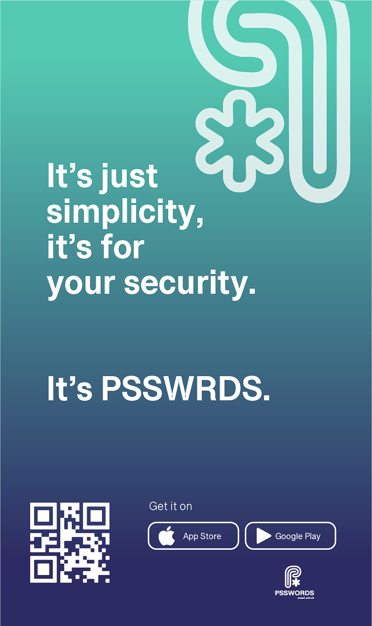
Welcome to my passion project: PSSWRDS, your ultimate digital guardian. With this slick mobile app, I've got your back in the online world. Say goodbye to password stress—we're here to keep your secrets safe. Check out our logo—a sleek 'P' with a star, symbolizing top-tier security and protection. Let's lock down your online presence, together!

The 'P' resembles the fingerprint pattern of a human finger, symbolizing individuality and personal security. The choice of aqua green and deep blue colors in the branding signifies trustworthiness and tranquility, instilling confidence that your valuable data is in safe hands. Join me in exploring this visual identity, where design elements seamlessly align with the app's mission to provide a shield for your digital world.
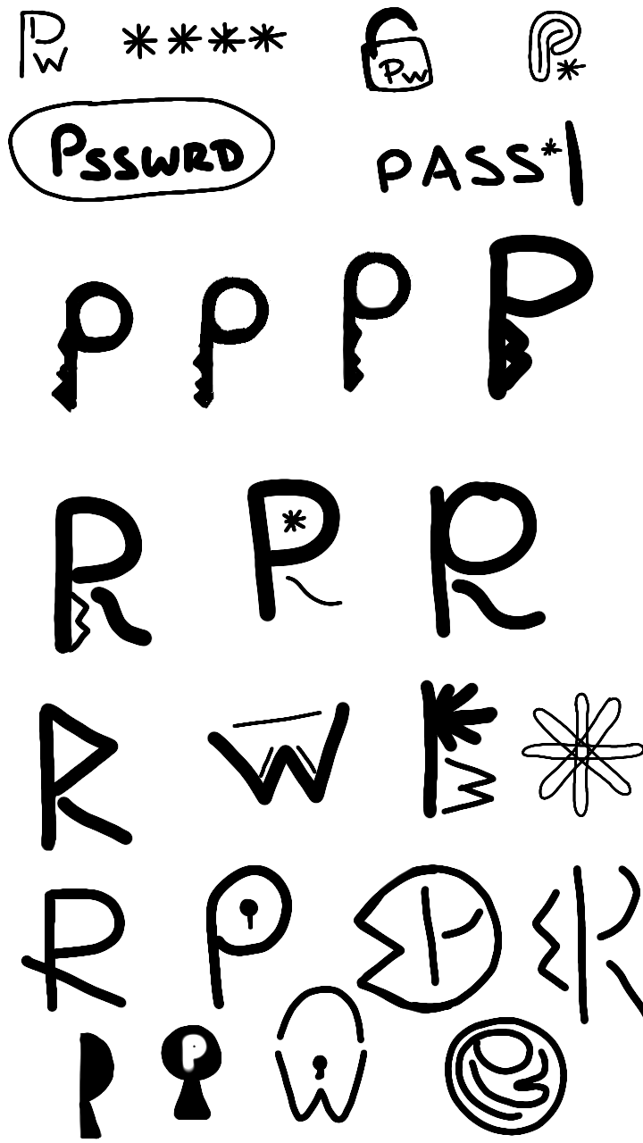
You'll find some of my preliminary logo concepts that led us to our final logo design. While symbols like keys, locks, and padlocks are quite common in the realm of security, I chose a different path. I wanted our logo to be not just distinctive but also memorable. That's why I opted for the 'P' as a fingerprint – a symbol of individuality and security in its simplest form. It's a logo that not only stands out but also resonates with the essence of our app, ensuring it's both unique and easily recognizable.