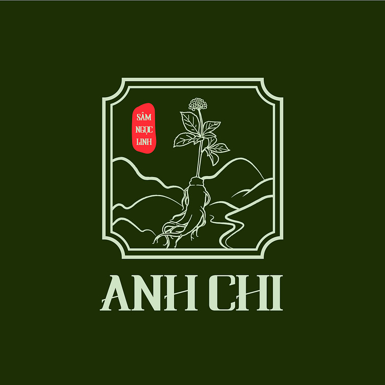
Sam Anh Chi | LOGO DESIGN & BRAND IDENTITY
Panax Ginseng has always been considered the national treasure of Vietnam, known as a very beneficial elixir for health. Sam Anh Chi is 1 of the pioneers in protecting and propagating Panax Ginseng.
The brand identity of Sam Anh Chi is designed with green as the main color. Green symbolizes strong vitality and health, creates a feeling of well-being and balance, helps to create a positive and bright impression for the brand. The logo is inspired by the legend of the rare Panax Ginseng., absorbing the essence of heaven and earth to form a precious medicinal plant of nature.
Designed by Bee Art
-
Client Sam Anh Chi
Logo and Branding Project. Logo is designed for Panax Ginseng Brand in Vietnam.
Copyright© Bee Art. All Right Reserved
Contact us:
• Hotline/ Zalo: (+84) 77 34567 18
• Email: info@beeart.vn
• Website: www.beeart.vn
• Facebook: https://www.facebook.com/BeeArt.vn


