Day 3: HyperFocus Landing Page - Designed for Success!
Today, I focused on crafting a compelling landing page to drive downloads for the productivity app, HyperFocus. Here's what I did:
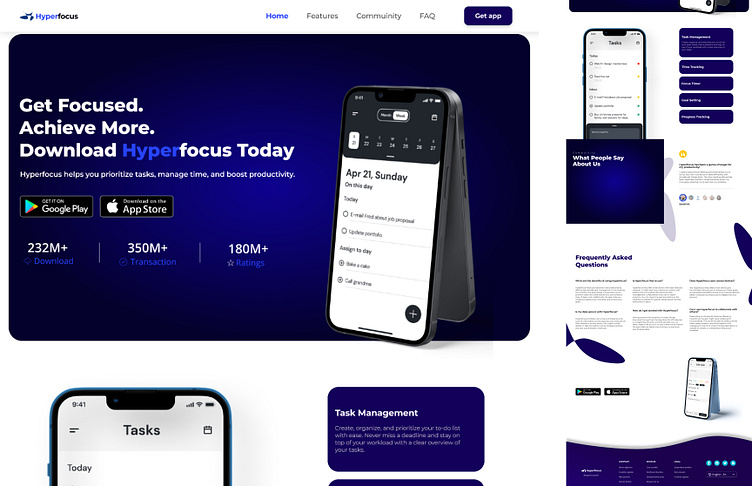
Hero Section Stands Out: I created a captivating mockup showcasing HyperFocus's user interface in action. This lets users see the app firsthand and understand its functionality. A clear and concise headline, like "Get Focused. Achieve More. Download Hyperfocus Today" grabs attention and communicates the app's core benefit. A subheading might explain key features like "Hyperfocus helps you prioritize tasks, manage time, and boost productivity." highlighting how they empower users.
Key Features Take Center Stage: I used clear descriptions and icons to showcase HyperFocus's most valuable features. Think "Task Management," "Time Tracking," and "Focus Timer." Benefit-oriented language is key here. I emphasized how these features improve users' lives, like "Stay Organized" or "Achieve More in Less Time."
Building Trust is Essential: Social proof goes a long way. I included positive testimonials from satisfied users praising HyperFocus's effectiveness. Finally, prominent app store badges (Google Play, App Store) build trust and demonstrate legitimacy.
Effortless Download - A Priority: The last thing I want is for users to struggle with downloading. Prominent buttons link directly to the app download pages in respective app stores.
Clean Design for Optimal Viewing: A mobile-responsive layout ensures the landing page adapts flawlessly to any device. Clarity is key, so I opted for a clean and minimalist aesthetic with clear fonts that match HyperFocus's brand identity. Finally, I chose a visually appealing color scheme that aligns with the overall brand image.
By incorporating these elements, this landing page is designed to effectively communicate the value proposition of HyperFocus, showcase its features, and ultimately drive app downloads.
