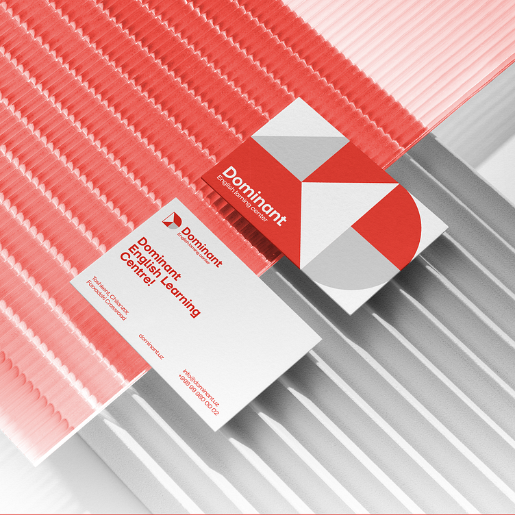
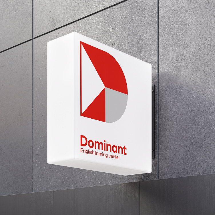
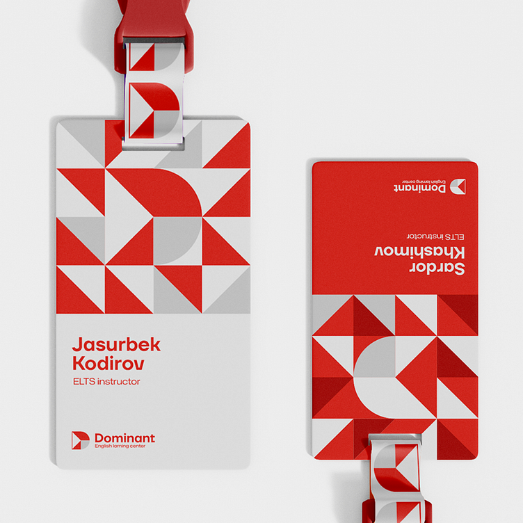
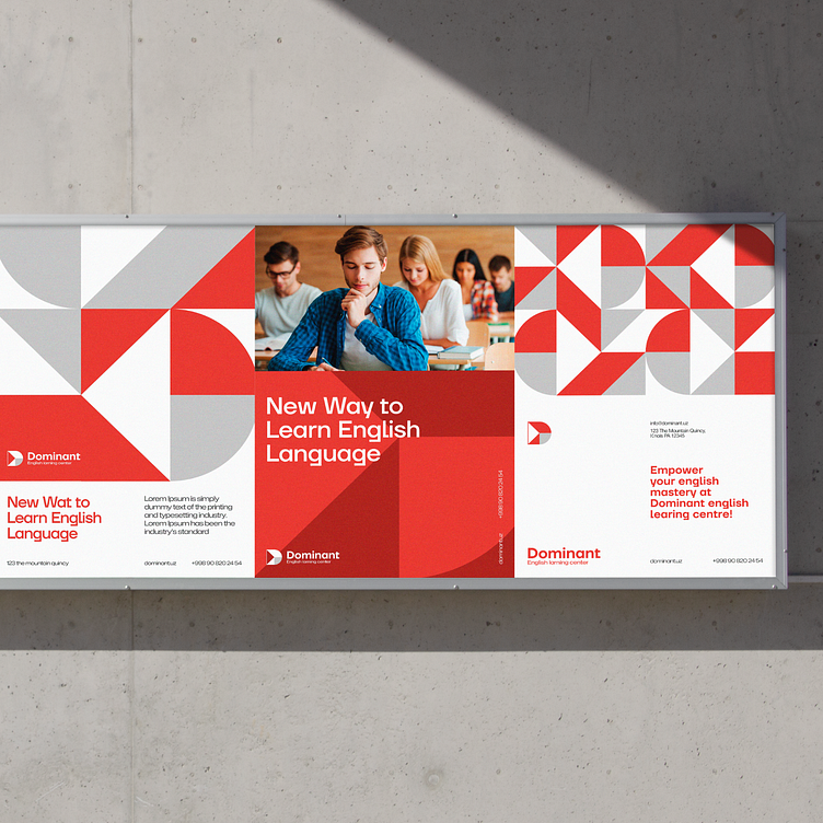
Dominant - Visual Identity


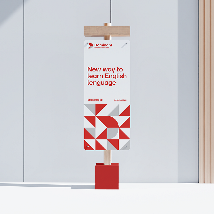
Dominant — is a learning center with strong mentors and that focused on teaching English through a progressive learning methodology. Our mission: to create a logo and logobook that shows the company's superiority and development symbols, remembers the English atmosphere, and represents an innovative educational center.The result is above! Based on the initial letter of the word Dominant, we created the symbol "D" and placed triangles — arrows that mean development, moving forward. We chose red, which means "power" and stands out from the crowd because it is contrasting color. At the same time, we used white and gray and developed patterns that create an environment of innovation.