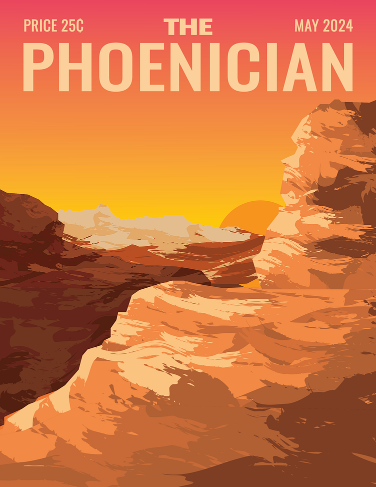
The Phoenician Illustrated Cover
I was inspired by old magazine covers from The New Yorker. Some artists have done their own variations on New Yorker magazines, such as the Tokyoiter and the Home Stayer. I wanted to create my own version called The Phoenician about life in Arizona.
Two things stand out when I think about life in Arizona. The mountains and the beautiful sunsets. I wanted to include both of these concepts in my magazine illustration. I imagine that this issue would feature a section about travel or hiking.
I wanted a warm color scheme for this project, as Arizona is also known for its hot summers. I used deep reds and oranges, and light yellows for this piece. The scene takes place at sunset, and I chose colors that would work well with the pink tones from the sky.
Originally, I wanted to do a more flowy illustration style, with more curves and rounded shapes. I also toyed with the idea of an arbitrary color scheme but settled on a more artistic style. I used the brush tool to imitate using a brush or a palette knife on canvas and created a unified color scheme that drew inspiration from the natural landscape.
While The New Yorker and its variations have a script-like font, I chose a blocky, sans-serif font for my concept of the Phoenician. With the mountain landscape, the heavier font style felt more fitting for the tone of the illustration.


