Philophile Magazine
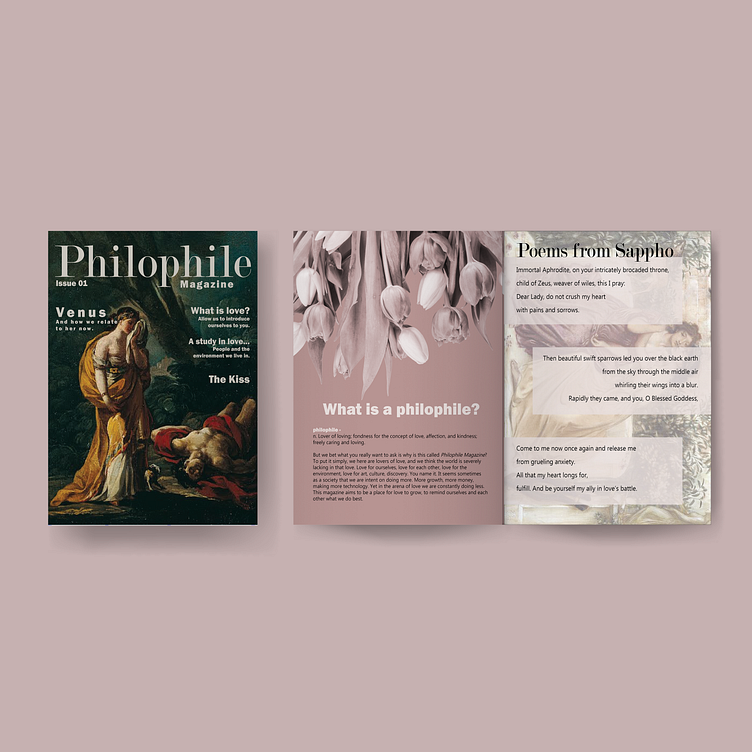
Philophile Magazine is an indie magazine preparing to release its first issue. The main theme of the magazine brand is love, in all of its forms and expressions. The magazine takes pride in being independent of large publishers and allowing its writers to be open about their thoughts and experiences.
For the design, I was inspired by scrapbooks. I wanted the layouts from the earlier pages to feel like someone was collecting some of their favorite photographs and poems and piecing them together. This design concept fits with the idea of the magazine brand. Philophile Magazine is a little “scrappy” because they publish independently and cobble together ideas within the artist group its creators have formed.
A set of sketches where I planned out the spreads for the magazine and brainstormed about the content I wanted to include.
Regarding color selection, I wanted to use pink, because it is recognized as the color of love. But I also wanted to include some brown and tan colors to add a sense of groundedness to the design. I chose colors that weren’t too oversaturated because this is an introductory issue. I wanted the colors to feel calm and inviting rather than shocking.
Mockup design by rawpixel on Freepik.com.


