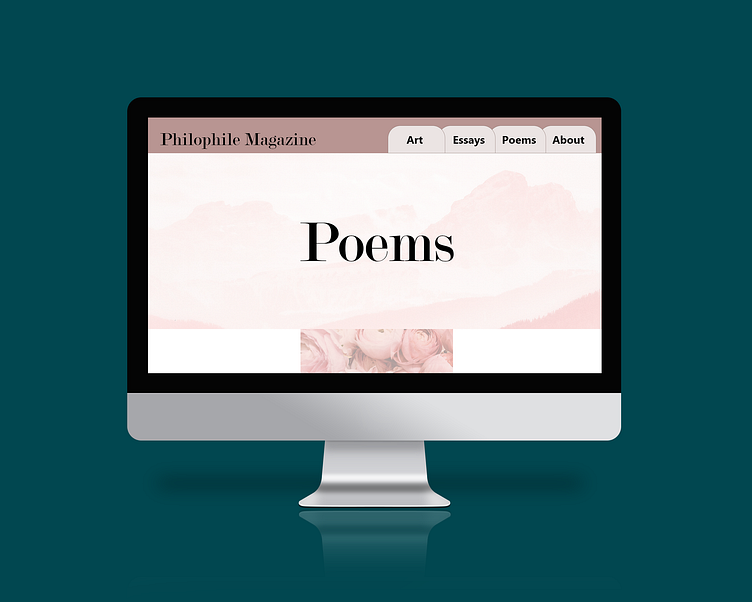
Philophile Magazine Prototype
I wanted to create a companion piece for the Philophile Magazine. I began prototyping websites as part of my senior honor thesis. I wanted to create a simple design that magazine readers could use to revisit some of their favorite essays, poems, or art from past issues.
I designed web pages to be displayed on a computer screen as well as phone screens. The phone screen designs are simplified to fit the smaller screens, but the design elements remain consistent.
I used various shades of pink for the design to carry the visual theme of love. I kept the fonts consistent with the ones I chose for the magazine design to maintain the brand standard.
Some early sketches to work out the layout and some of the prototyping functionality.
I did a little bit of prototyping for this website to show the ease of use. The website is not overly complex but still uses some of the design elements from the magazine.
Rather than scrapbooks, zines were more of an inspiration for this website. Some zines make use of pull tabs, or strips of paper to create a more dynamic experience. For this website, I designed the navigation bar to look like tabs from a file folder or page markers. The shapes for each of the page sections pull across the screen to encourage the user to explore.
Design mockups by graphictwister and rawpixel.com on Freepik.


