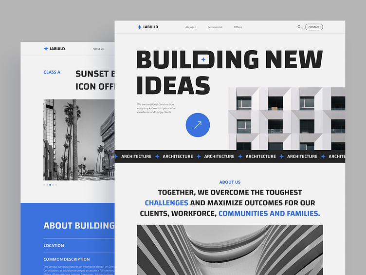
Construction company website design
Hi guys!
I'm a big fan of brutalism and architecture, so I decided to put these things together and create a website design concept for a building company. Not to make this design completely B&W I decided to add blue color that among other things evoke feelings of confidence, trust and tranquility.
I hope you like this project, will be happy to see your feedback
P. S. I took some of the photos and information from the mccarthy company's website, so to be clear wanna say that all materials belong to their owners and have been used for non-commercial purposes only :)
Full page
One of the inner pages
More by Margarita Mikhalyova View profile
Like


