Day 2: UI Design Challenge - Mobile Ecommerce Checkout
Day 2: UI Design Challenge - Mobile Ecommerce Checkout
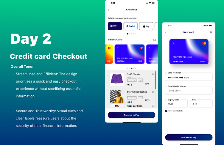
Today's challenge tackles a crucial mobile experience: the checkout process for an e-commerce app. Here's a user-centered design prioritizing both efficiency and security:
Checkout Flow:
- Order Summary Section
- "Add New Card" Button
- Saved Cards
- "Proceed to pay" Button
Add New Card Page features:
- Secure Card Information Form
- "Save Card" Toggle
- "Add Card" Button
Overall Tone:
Streamlined and Efficient: The design prioritizes a quick and easy checkout experience without sacrificing essential information.
Secure and Trustworthy: Visual cues and clear labels reassure users about the security of their financial information.
More by Godwin Okechukwu View profile
Like
