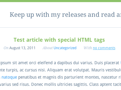
Breeze : Article
I'm still working on my portfolio. I first coded a static version but then I stopped because I wanted to switch to wordpress. I used Johan Brook's barebones theme called Whiteboard as a base to start properly my own theme.
You are looking at the blog part, I decided to center the header (title+metas) of each article. I used to align it to the left but I think this is a nice change because it creates white-space on the side, which creates a more obvious limit between each article.
It's my first experience with SASS, I must say that I love it so far, it saved me a lot of time and with all the nesting/mixin/variables, it makes it easier to update the theme or even understand the structure. I would recommend it to any web designer, it's really easy to use.
I am using two fonts: Droid Sans and Droid Serif, and I am probably going to switch the font of the blog content to serif.
About the portfolio: I am going to use http://isotope.metafizzy.co/ to filter elements from the gallery.
Any advice/feedback will be appreciated.
Note: It will be in English, forget about the sidebar that begins with "Catégories" (French)

