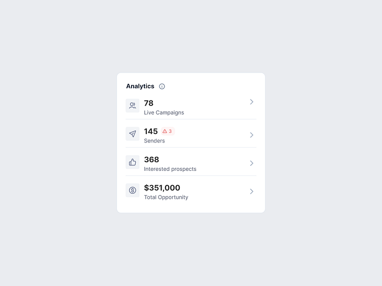
Dashboard analytics component
Hello Guys, 🔥
I have designed Dashboard analytics component
Approach:
Horizontal vs. vertical layout
The analytics component should take as little space as possible since it provides just an overview of metrics. The other components on the dashboard have a higher priority.
Metric with Icon vs. without icon
Leveraging psychology which states we recognize visuals more, I decided to go with icons to provide better recall and recognizability.
Analytics Header with/without Information icon.
Users are ambiguous as to how metrics are calculated. To remove that ambiguity using an information icon felt like a better approach, which explains how metrics like “Total opportunity” etc. are calculated
✦
Let's work together!
manishxdesign@gmail.com
More by Manish Kumar Yadav View profile
Like
