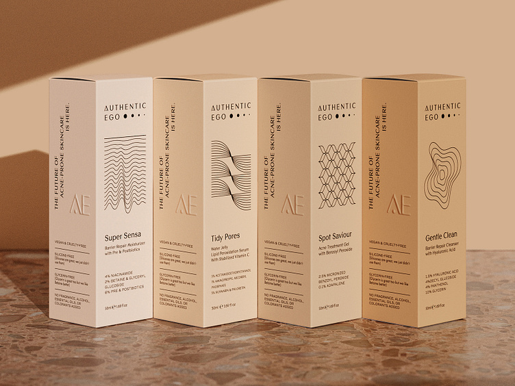
Authentic Ego Box Packaging
Authentic Ego helps people stop fighting with their skin and reclaim their skin’s natural power to heal itself with fungal acne safe skincare. AE's brand story is rooted in science, healing, and self-empowerment.
We crafted a sleek and understated visual identity, infused with a playful spirit, intentionally avoiding the overused pink palette that dominates many millennial brands today. Instead, we embraced a range of lighter and deeper skin tones, symbolizing inclusivity and diversity.
The logotype captures their holistic, four-step approach to skincare, targeting acne treatment and prevention—illustrated by four dots that gradually fade, mirroring the healing process of blemishes as they naturally disappear. For the typography, we chose clean, contemporary fonts that embody simplicity while elevating the brand's modern ethos. To complement this, we introduced a series of abstract, graceful lines inspired by both geometry and science, adding a layer of elegance and dynamism to the brand’s overall visual language.
Results
In the first year they launched a new SKU and the packaging design has been praised by their customers and social media creators, helping them to stand out and reach their annual sales target.
Services
Visual Identity, Brand Messaging, Packaging Design, Icon Design, Newsletter Templates, Social Media Templates, 3D Renderings, Shopify Customization
Team
Brand Strategy & Messaging - Jill Wise
Visual Identity Design - Necula Creative
Product Photography - Weekend Creative
