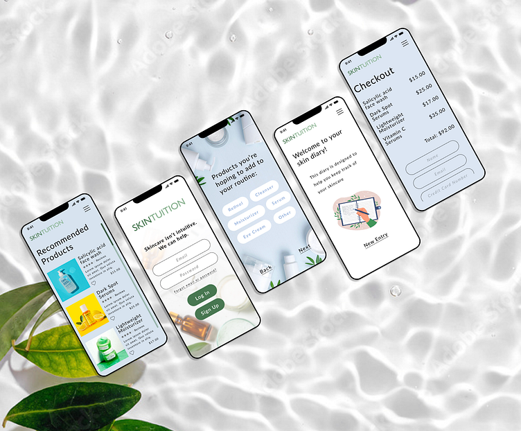
Mobile Application Design
Summary: An imagined skincare app that utilizes facial scanning technology and partners with dermatologists to provide users with trustworthy feedback and medical-grade products, guiding them towards better skin health.
Duration: December 6th, 2023 - January 3rd, 2024
My Role: User Experience & User Interface Designer, User Research
The Concept
A skincare app with the ability to scan face and generate instant feedback
Through scans, users receive detailed information on skin conditions
Scans are sent to licensed dermatologists who in turn provide a detailed report.
Research-backed medical advice and products are recommended to users in order to better their skin health
Simple, fast, and easy to use
Does not bombard user with ads that promote products for profit
After coming up with the concept, I utilized user surveys as well as user interviews to gather valuable insights into user preferences, behaviors, and pain points.
User Surveys
Of 17 survey participants,
82.4% have tried to research their skin concerns online
23.6% consider themselves to be a 7/10 or higher on a scale from 1 to 10 in skincare knowledge
User Interviews
User Interview Insights
From the user interview insights and survey responses, I crafted an affinity diagram
Affinity Diagram
Research Conclusions
Most interviewees had little knowledge about skin care and felt lost when trying to treat their skin concerns.
Most common concerns were dry skin, acne, hyperpigmentation, and skin sensitivity.
All interviewees had searched for treatments online with generic results.
Most of the participants valued their time and wanted a quick and effective routine.
Most valued recommendations from Skin professionals, although few had been to a dermatologist.
The next step involved creating a user persona, which helped me better understand and empathize with the target users for the imagined app
User Persona
I then conducted a comprehensive competitor analysis to identify key strengths, weaknesses, and opportunities in the market, which would help differentiate the app and enhance its competitive edge through informed design decisions.
Competitor Analysis
While examining existing solutions on the market, I came across Neutrogena's face scan feature, which scans your face, highlights problem areas, and recommends Neutrogena products. While the concept was intriguing, I saw an opportunity to enhance this feature for my application. My product will aim to highlight skin concerns detected by the scan, send the results directly to a dermatologist for professional analysis, and then recommend medically backed products tailored to the user's specific skin needs, rather than simply advertising products.
Neutrogena's Face Scan Feature Analysis
The next step in my ideation process was to further explore features I wanted the app to have. I created an "I Like, I Wish, What If" diagram to help better visualize this process
I Like, I Wish, What If
My next step in the design process involved creating a Value Proposition Canvas to analyze the consumer, their specific needs, and how my product addresses those needs. Following this, I crafted a compelling Value Proposition Statement to communicate the unique benefits and value of my application to potential users
Value Proposition Canvas
Value Proposition Statement:
“Skincare isn’t intuitive, we can help.”
My next steps involved creating a storyboard to visualize the user interactions, crafting a user journey map to outline the user's experience from start to finish, and designing a user flow to illustrate the sequential steps and interactions within the application, ensuring a seamless and intuitive user experience
Storyboard
User Journey Map
User Flow
From there I was ready to start prototyping the app. I began by sketching some paper wireframes, then transitioned those to Figma for a LoFi wireframes.
Paper Wireframes
Digital Wireframes
I then performed several user tests on the LoFi prototype to see what users had to say and make the changes prior to creating the high fidelity mock up
Usability Testing Observations
Would download an app for this service
“Scan new” button is confusing, needs more explanation as to what the button means
The onboarding process was quick and simple
Would like to be able to buy suggested projects within app
Need more direction for skin diary - not intuitive
Guerilla Usability Testing
Example of one of the user test tasks:
User Insights
From the guerilla tests I created a feature prioritization matrix and moved onto the HiFi prototype
Feature Prioritization Matrix
HiFi Figma Prototype
Next Steps
User Feedback Collection: Conduct user testing sessions with a diverse group of participants to gather feedback on the mobile prototype and identify areas for improvement.
Iterative Design Refinement: Based on the feedback received, iterate on the mobile design to address any usability issues, enhance user experience, and improve overall aesthetics.
Usability Testing: Perform additional rounds of usability testing with the target audience to validate the design changes and ensure the app meets user needs and expectations.
Visual Design Enhancement: Focus on refining the visual design elements, such as color schemes, typography, and imagery, to create a cohesive and visually appealing user interface


