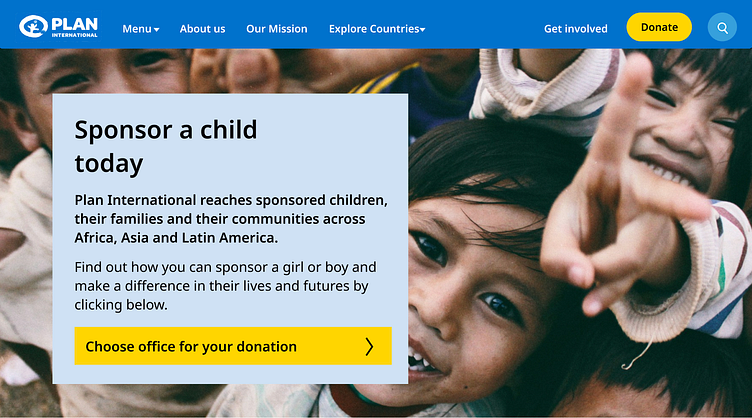
Plan International Nonprofit Website Redesign
Summary: Redesign of Plan International’s website with the intention of driving users to the donation page as well as a cleaner, more organized navigation
Duration: February 12th, 2024 - March 6th, 2024
My Role: User Experience & User Interface Designer, User Research
Success Metrics: 83.33% increase in donation button clicks
Project Overview:
The Problem: Several website errors including a convoluted donation page with excessive options, inconsistent page navigation, and a cumbersome dropdown menu made it difficult to align with the nonprofit’s goals.
The Solution: By implementing intuitive design solutions, I streamlined the donation process, clarified navigation pathways, and simplified menu interactions, resulting in a more user-friendly and accessible website experience.
Tools Used: Figma, Trello
Time Frame: 4 weeks
What Is Plan International?
Plan International is dedicated to breaking the cycle of poverty by focusing on the empowerment of young girls in vulnerable communities and emergency situations worldwide.
Through comprehensive education, healthcare, and protection programs, they strive to unlock the vast potential of every girl, ensuring they have the opportunities to learn, lead, decide, and thrive.
UX Design Process
Heuristic Evaluation
Through a comprehensive heuristic evaluation of the current site, I noted several errors, particularly a confusing donation page layout, cluttered page navigation, and overwhelming dropdown menus.
Move logo to the left of the screen
Make donation button more noticable
Dropdown menu too cluttered and overwhelming
Personalized story is a nice touch/allows user to empathize
Arrows look weird
Search bar in menu is useful
Needs constraints
Before I began redesigning, I conducted a competitor analysis of other nonprofit organizations as well as several user interviews on the current site in order to get a sense of what users thought and draw on competing sites (what was working and what wasn’t
Competitor Analysis
User Interviews
The user interviews highlighted issues with website navigation, a cluttered dropdown menu, confusing donation selections and overall problems with the layout.
I then came up with a user storyboard, problem statement and value proposition statement.
User Storyboard
Problem Statement:
Plan International aims to enhance the lives of young girls in vulnerable communities and emergency sites through philanthropy and volunteer engagement. How might we use our website to create persuasive calls for aid to better reach more volunteers and donors, and simplify the donation process to be as seamless as possible.
Value Proposition Statement:
“Empowering Young Girls, Transforming Futures”
From here, I created a new site map for easier navigation of the website and began wireframing. I especially wanted to highlight/drive traffic to the donation page, clean up the menu, and better organize the secondary pages as they were repetitive and did not contain the information specified.
Site Map
PRIORITIES
Clear language
Logical placement organization of pathways
Fast and easy navigation of information and news
Early Development & Wireframes
Next, I conducted a second round of user interviews, and received feedback on the LoFi prototype before iterating it into the HiFidelity mockup.
User Feedback
“The website feels too large, it takes forever to scroll down the screen.”
“I like how the drop down arrow expands to show your options!”
“Adding another way to indicate you can click, maybe a highlight
or underline, would be nice?”
“I wish the donation options were laid out so you could see
all of them before donating.”
Style Tile
High Definition Prototype
A/B testing was conducted on the HiFi prototype as compared to the original website. Below are the success metrics.
Success Metrics
For the redesign:
As far as driving traffic to the donation page, there was an 83.33% increase
in donation button clicks.
In highlighting the mission statement, there was a 100% increase of user
views.
Furthermore, we saw a 66.67%increase in menu clicks.
What's Next?
Establish Contact:
Engage key stakeholders and select a web design agency or freelancer through proposals and interviews.
Mobile Development:
Plan and implement a responsive design, focusing on mobile-first principles and optimization for various devices.
Testing and Launch:
Conduct cross-browser and usability testing, optimize performance, and prepare for the website launch based on feedback and refinements.


