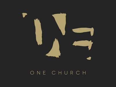
One Church
I wanted to do a new logo for our church that has combined a predominantly white church and a predominantly black church into one. No steeples, rivers or the other terrible ideas churches have. Instead, I used brush strokes to represent different things coming together to make something complete. To make One. Be outside of the box a bit.
More by Chris Diggs View profile
Like
