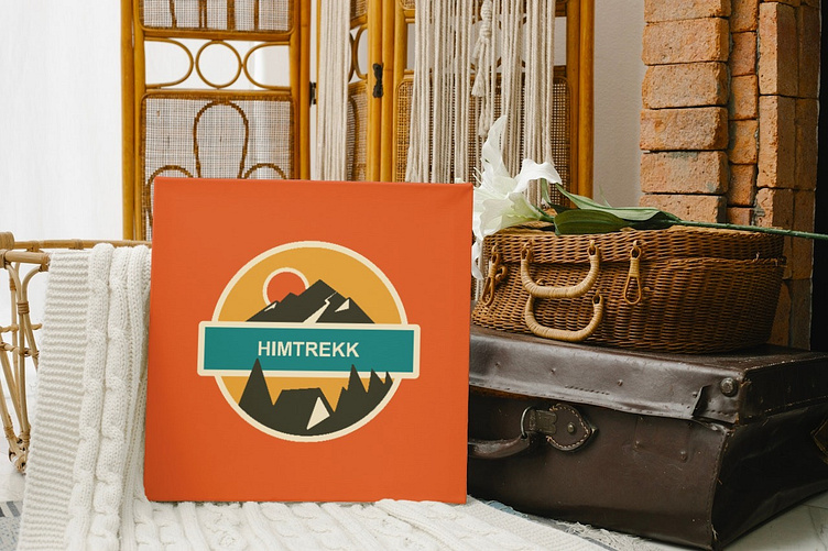
Himtrekk - Brand Identity Design
Himtrekk-
Brand Identity Design
🏔️ Embrace the Adventure with - Himtrekk !🏕️
The brand identity for “Himtrekk” centers around exploration, connection with nature, and a sense of adventure. The purpose of incorporating earthy colors into the logo is to evoke feelings of groundedness, authenticity, and harmony with the natural world.
Here’s a description of the brand identity:
Logo Description:
The logo embodies the spirit of exploration and adventure in the majestic Himalayas, with a mountain peak symbolizing awe-inspiring destinations and a tent representing the commitment to providing unforgettable trekking experiences.
The typography used for Himtrekk:
Bold and rugged, mirroring the rugged terrain of the wilderness and conveying a sense of strength and resilience.
Purpose of Earthy Colors:
The earthy color palette chosen for the logo and brand identity serves multiple purposes:
1.Nature Connection: The use of greens and browns invokes imagery of forests, mountains, and natural landscapes, reinforcing the brand’s association with outdoor adventure and exploration.
2.Authenticity: Earthy tones convey a sense of authenticity and genuineness, aligning with Himtrekk’s commitment to providing genuine outdoor experiences and fostering a deep connection with nature.
3.Harmony and Balance: These colors create a harmonious and balanced aesthetic, reflecting the brand’s values of balance, sustainability, and respect for the environment.
