Daily UI challenge 004- Calculator
Hello everyone :) it's time to design a calculator, as a daily UI challenge number 4.
That's going to be easy, I thought to myself. I began by browsing the internet for examples, comparing them to the calculator app on my phone, trying to cherry-pick the best features from each.
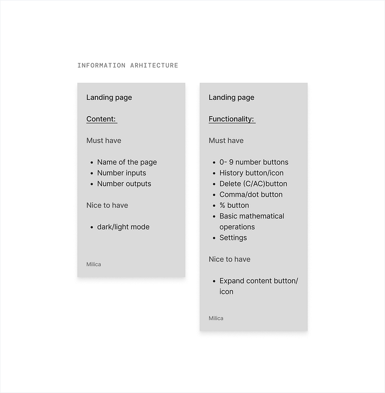
It helps me to start my design process by writing out some must have elements for content and functionality of my app/website, so I did that. Then, I started designing in Figma, aiming to combine the familiarity of my phone's calculator with some innovative online designs.
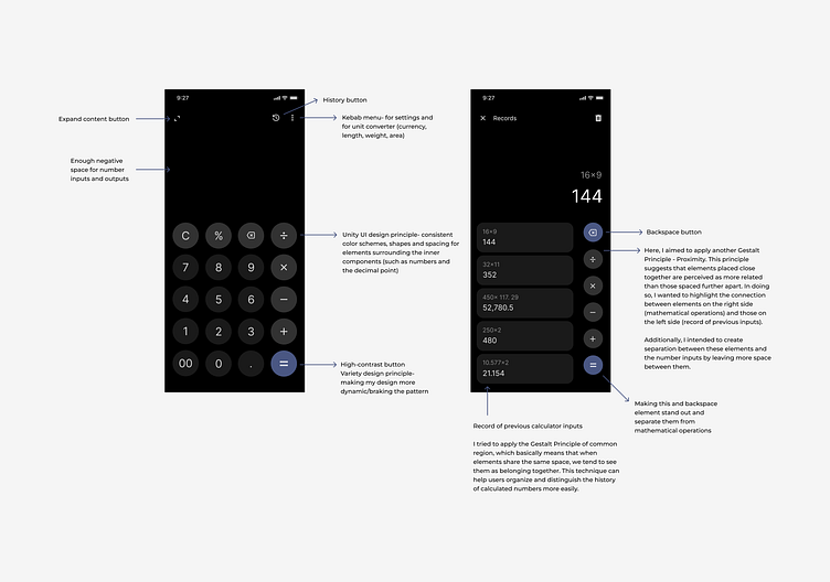
The layout of the calculator on my phone seemed standard, but I wanted to understand why it was designed that way. I asked myself: How much should the equals button and number input/output space occupy? Where's the best spot for the backspace or C/AC button? Should there be an option to view calculation history?
I also wanted to explore how UI principles manifest in design, such as emphasis, which highlights elements to prompt action, and hierarchy, which organizes information by importance. Additionally, I was interested in examining concepts like unity and variety, which contribute to the overall aesthetic and user experience.
While I was searching for more information on calculators, I stumbled upon an article titled What I learned designing a calculator UI | by Karim Merchant | Medium by Karim Merchant on Medium from 2018. I know, it's not the most recent, but it's a goodie. I found it fascinating how much thought and research the author put into solving this challenge. His article begins with the sentence: 'Sometimes the simplest challenges can add up to a headache.' And he meant it.
I highly recommend reading it if you're curious about why the UI of most basic calculator apps looks so standard.