Construction Website Design Concept
💌 Have a website idea? Let's bring it to life together!
hello@ronasit.com | Telegram | WhatsApp | Website
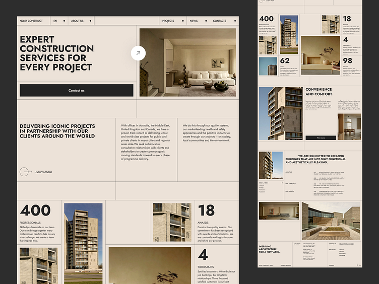
Hi all! We crafted a website design for a construction firm to effectively showcase their services, achievements, and project portfolio.
The website organizes content into blocks detailing the company’s history, awards, key figures, projects, and partners. This structure is designed to provide a comprehensive overview of the firm's competencies and credibility.
We chose a sand-colored background paired with black for the main UI elements, creating a sophisticated yet sturdy visual theme reminiscent of construction materials and architectural design.
A standout characteristic of this design is the unique grid layout of the blocks, reflecting the architectural creativity of the firm. This unconventional arrangement not only captures the essence of the company's innovative approach to construction but also enhances user engagement by providing an interesting browsing experience.


