HAELYN COSMETICS | LOGO DESIGN & BRAND IDENTITY
HAELYN is a cosmetic brand born to honor the pure beauty of women. That beauty is like a cool stream, bringing youthfulness to your body. Inspired by the famous Korean fairy tale with a "wise" balance from natural ingredients, HAELYN is confident to be a "youth spring", bringing pure energy to your skin and beauty.
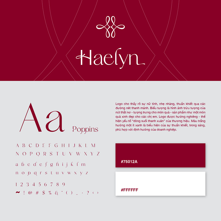
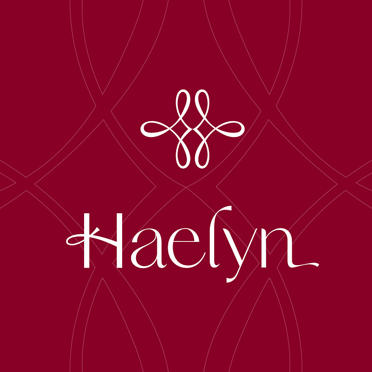
HAELYN brand identity expresses femininity, lightness, purity through slender lines. The logo design is an abstract image of a bow tie - symbolizing the gift, conveying the message that each product is a beautiful gift. White towards a little blue is a sign of purity, purity, in line with the direction of the business. Combined with red pink to create high-class luxury for the brand.
Designed by Bee Art
-
Client Haelyn
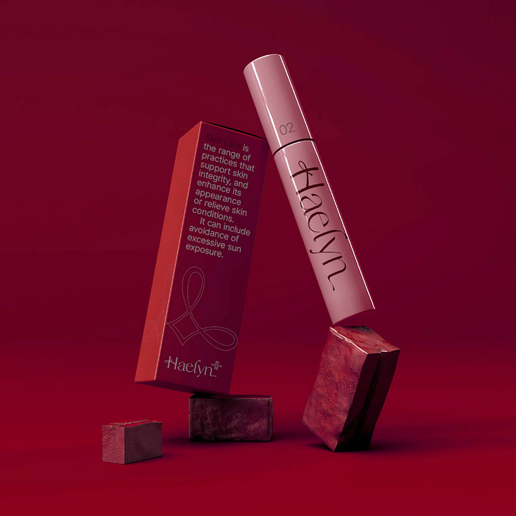
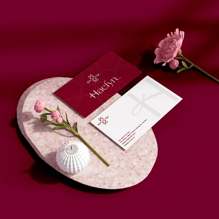
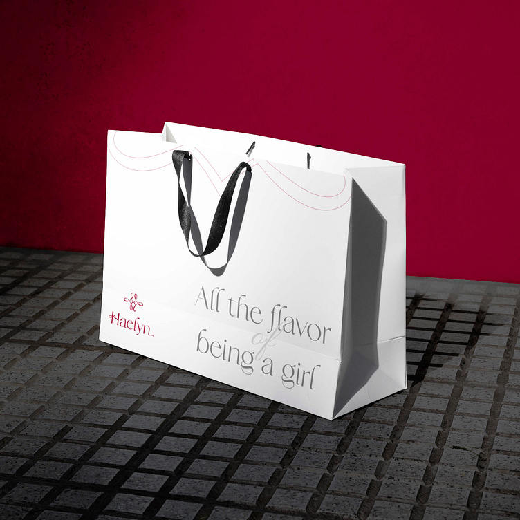
Logo and Branding Project. Logo is designed for Cosmetics in Korea.
Copyright© Bee Art. All Right Reserved
Contact us:
• Hotline/ Zalo: (+84) 77 34567 18
• Email: info@beeart.vn
• Website: www.beeart.vn
• Facebook: https://www.facebook.com/BeeArt.vn