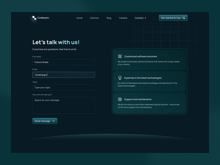
Codesync. - Contact form 🐲
Happy Friday! 😎
Today I would like to show you the conceptual design of the contact page. 🚀
When designing a contact form, there are several key issues to consider to ensure its effectiveness and usability for users:
🐲 Reducing the number of required fields to a minimum to minimize user resistance in completing the form.
🐲 Simple and intuitive structure. Make sure the layout and structure of your form are clear and easy to understand.
🐲 Context-sensitive help. Add quick tips or contextual hints to help users fill out your form.
🐲 Submission Confirmation. After submitting the form, provide users with confirmation of successful submission. This could be a simple message informing you of success or redirecting you to a confirmation page.
What do you think? Let me know in the comments! 💬
Do you like it? Great! Don't hesitate to look at my profile!️
Enjoy! 🤙
Contact: wojteklyzwa@gmail.com 🎯
