Ve formě Logo Design & Branding
So sweet!
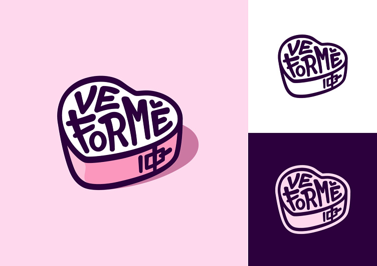
Designing the logo "Ve formě," for a bakery/cupcake shop, was a delightful journey where creativity, humor and sweet taste danced hand in hand. The name, translating (from Czech language) to "in the baking form" and the second meaning humorously saying "in a good form (physically)," sparked the inception of a logo that seamlessly captured both interpretations. Taking inspiration from this witty wordplay, I sculpted a heart-shaped emblem that not only resembled a baking mold but also served as a playful nod to the notion of staying "in form." Custom typography was meticulously crafted to reflect the brand's personality, adding a touch of elegance to the overall design.
Furthermore, recognizing the importance of versatility, I crafted two distinct versions of the logo, each tailored for diverse applications. Whether it's gracing bakery boxes or adorning social media profiles, the "Ve formě" logo stands as a beacon of creativity and humor, inviting patrons to indulge in the sweetness of life while sharing a laugh. In every curve and stroke, this emblem embodies the essence of the bakery, promising not only delectable treats but also a lighthearted experience that leaves a lasting impression.


