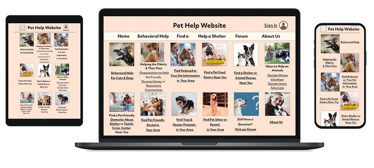
Pet Help Responsive Website
Pet Help Responsive Website
Designed for Google's Course: Designing a User Experince for Social Good using Adobe XD - 2023
The Product: A responsive website (one that changes to fit the size of your screen) created for people who are having trouble caring for their animals. The site gives advice on behavioral problems, shows were to find pet food pantries or vet clinics, and helps people find pet friendly rentals or domestic violence shelters. This project was made after the Pet Help App project.
My Role: Sole UX Designer conducting user research, wireframing, mockups, as well as creating high & low fidelity prototypes.
Challenge: Creating a responsive website site for a people having trouble caring for their pets using Abobe XD. I choose this project because in my city a lot of people move and leave their pets behind or abandon them due to lack of money.
Goal: Creating a high-fidelity prototype for a pet help responsive website.
Starting the Project: Prior to creating the design, I created personas, identified pain points and created a user journey, focusing on empathizing with the user.
Creating the Design: After identifying problems that the users might need to have solved, I created a sitemap and low fidelity paper prototype for the app, before creating digital wireframes and low and high fidelity prototypes using Adobe XD.
User Personas
Sitemap
Competitive Audit: Prior to starting the design, I completed a competitive audit of florists to determine how my website could stand out from competitors. You can view the full audit here.
Creating the Designs:
The Design: From the Pet Help app project which I had already completed, I had come up with ideas for the responsive website and how it should be set up. I decided that a card design layout would work best for this responsive website, to maintain the same overall feel of the website regardless of the platform it was being viewed from. Three sizes were created, with a desktop, mobile, and tablet size.
Low Fidelity Wireframes
Desktop Wireframes
Mobile Wireframes
Usability Study
Usability Study: I conducted two usability studies for this project. The first usability study was conducted after finishing the low-fidelity prototypes and a second was conducted after the high-fidelity prototypes were finished. Both studies were moderated studies of five participants, with each interview taking no more than 10 minutes.
Affinity Diagram
Changes to the Design After the Usability Study
High Fidelity Mockups
Desktop Mocksups
High Fidelity Prototypes
What I Learned
In this project, I learned how to make drop down menus. I also learned more about site mapping tools and website color pickers.


