Marketplace Mobile App
Hey! Check out Marketplace App design 🛍️
Here users can buy secondhand clothes 👗🩳
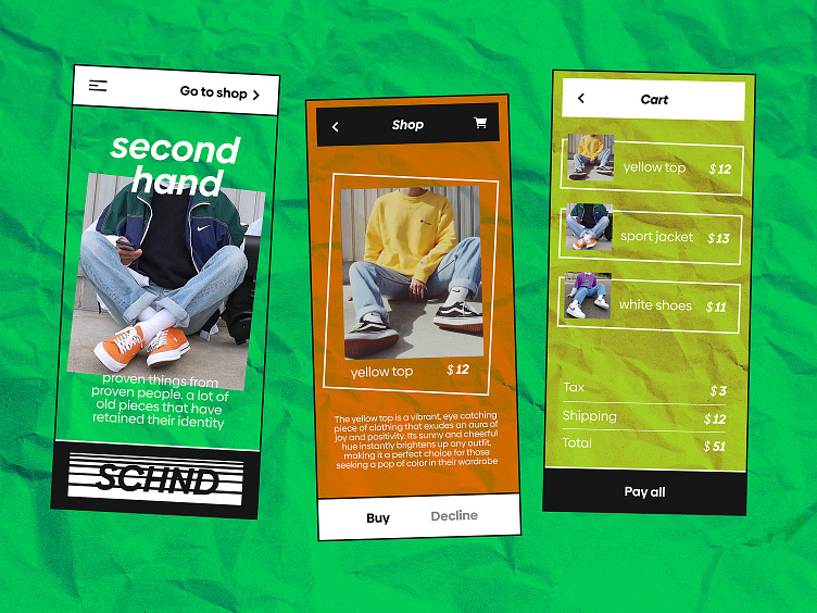
The shot displays three screens 👇
👋 The Welcome screen contains the app description and allows users to switch to the online store or open the additional menu with information.
👕 The second screen offers the clothes options based on the user’s preferences. Here users can see the clothes description, add the items to the Cart, or reject the recommendation. To view other variants, they need only to swipe right.
🛒 The third screen is the Cart. Here users see the items they wish to purchase and their costs. Below, all the order details are displayed. After a user makes sure everything is right, they switch to payment.
🐼 To emphasize the photos of clothes, I have created a B&W design. A few additional colors make the items look more presentable.
The app allows users to find and buy secondhand clothes 👍
