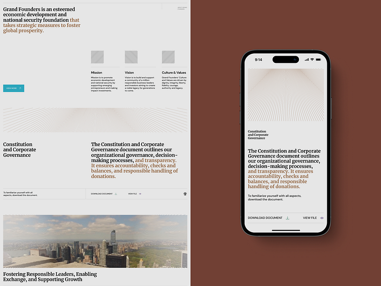
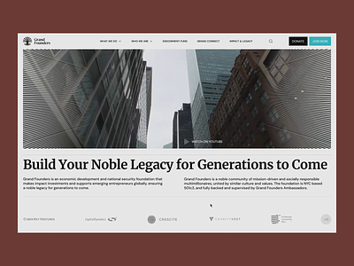
Homepage for an investment fund | Lazarev.
When we updated the Grand Founders website, Lazarev aimed to bring people together and form a community of socially responsible individuals focused on making a positive impact. 😎
Before we began designing, we studied the website's audience and checked out similar sites. After the research and stakeholder sessions, we decided to blend intentionally old-school brand vibes with modern design solutions.
We used a magazine layout, san-serif fonts, a simple and organized structure, and calming colors. We also added a special effect called moiré, which is a nod to money. These choices make the website feel like an exclusive club.
More by Lazarev. UI/UX Design Agency View profile
Like


