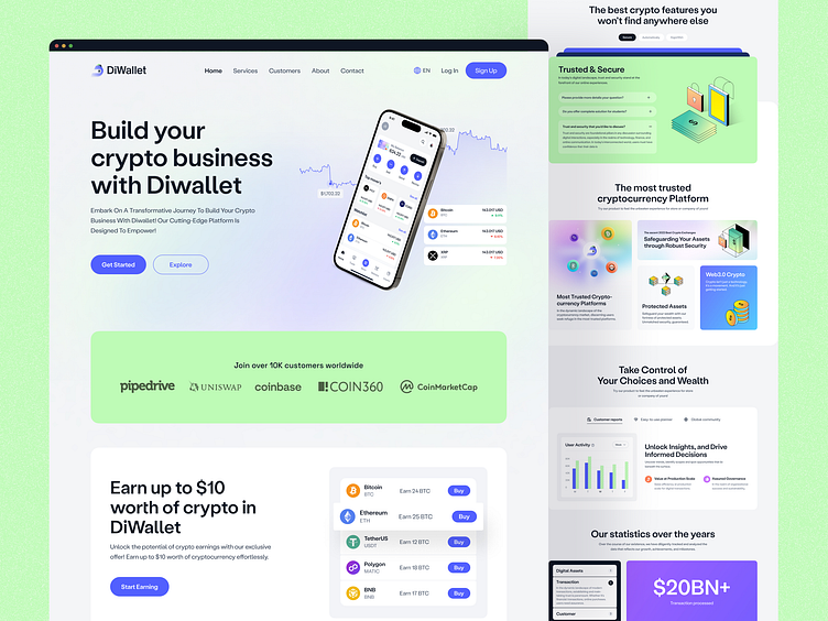
Crypto Landing Page
Worried your crypto app doesn't scream trust?
Confusing design = lost users.
We created a solution: a sleek crypto wallet landing page that builds trust.
Why it works:
Clear & Easy Interface: Find what you need instantly. ✅
Consistent Colors: Feels professional, not messy. ✨
Bold Text: Easy to read, even on mobile.
Simple Buttons: No getting lost here.
See the full case study on Behance ➡️ Diwallet | Crypto Mobile Wallet App
🔍 Also Check 👇
→ Sign Up and Verification Process
Do you want to make your landing page?
Schedule a 30-minute free consultation call with one of our landing page design experts ↙️
☎️ 👉🏼Calendly.com
Let's talk about your project..
✉️ hello@musemind.agency
Website 🌐 musemind.agency
Explore Our Design Case Study Featuring ➡️ Behance
Let's Check Our Others Dribbble Profile
musemind saas • musemind mobile • musemind branding
Follow us to see more exciting shots and insights on
Linkedin I Instagram I Twitter I Medium I Facebook I Webflow I WhatsApp


