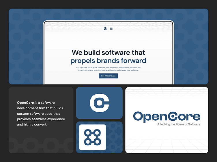
OpenCore - Software Development Firm Brand Guidelines
Hello everyone! 🔥
Today marks the big reveal of OpenCore's brand guidelines.
________________________________________________________________________________________
OpenCore Inc. is a software development firm based in Ontario, Canada.
We specialize in UI/UX design, branding, and development.
Logo Design
Creating the OpenCore logo was a thoughtful process that harmonized the brand's name and its forward-thinking vision. Focusing on capturing technological disruption, we aimed to convey modernity and innovation.
Every curve, colour, and element was meticulously chosen to reflect the brand's identity. The logo is more than just an image.
It's a visual representation of OpenCore's journey towards the future, where innovation and excellence converge.
Our Palette is more than just random shades.
We chose them deliberately to match our company's character, culture and values to evoke specific emotions.
Navy Blue - stands tall as our primary hue, a symbol of trust and reliability.
Cyan & Gold - step in as accents, heralding innovation and luxury.
Dark Grey - represents versatility & professionalism
Together, these colours craft our narrative of excellence, integrity and innovation.
Typography is 90% of the design.
DM Sans is used as OpenCore's primary typeface, due to their readability, modernity, versatility and professionalismIt’s ability to convey innovation and clarity aligns with OpenCore's brand identity and communication goals.
Brand Pattern - an extension of our identity.
OpenCore's brand pattern is more than just a simple design element.
This pattern takes the heart of OpenCore's logo - the "core" - to form a lattice network that captures the software industry's interconnectedness among many unique sectors and disciplines.
Featuring OpenCore Stationery
Business Card - With a sleek design that mirrors our brand's modernity and sophistication, our business card is more than just contact information – it's a conversation starter.
Letterhead- Our cover letter is designed to make a statement from the get-go. With clean lines, bold typography, and a touch of elegance, our letterhead sets the tone for professionalism and attention to detail.
Here's a full brand guideline book view:


