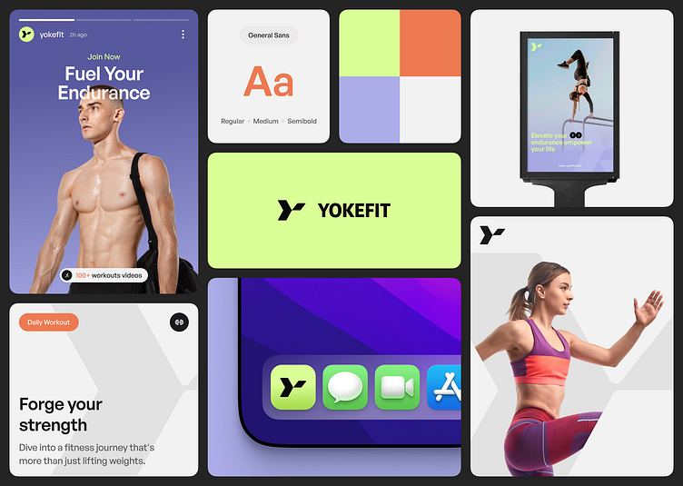
Yokefit - Workout Branding App
Hello, Dribbblers 🙌
Take a look at our fresh Design, giving you a sneak peek the concept of Yokefit - Workout App Branding , before its incredible makeover. Let's take a deep dive!
Overview:
Yokefit is an app dedicated to building strength and endurance, with a nod to the old-school term "yoked" for someone who is very muscular. Using the colors lime, which symbolizes health, and purple, which is associated with reflection.
Logo Concept
The logo is inspired by the letter Y, which is the initial letter of the brand name, combined with the silhouette of a workout movement.
Partner with Kretya Studio Now!
Intrigued to collaborate? Share your thoughts in the comments and reach out at
hello@kretyastudio.com | kretyastudio.com
Stay connected to our journey by keeping up with us on
LinkedIn | Instagram | Behance | Clutch for the latest updates.
More by Kretya Studio View profile
Like


