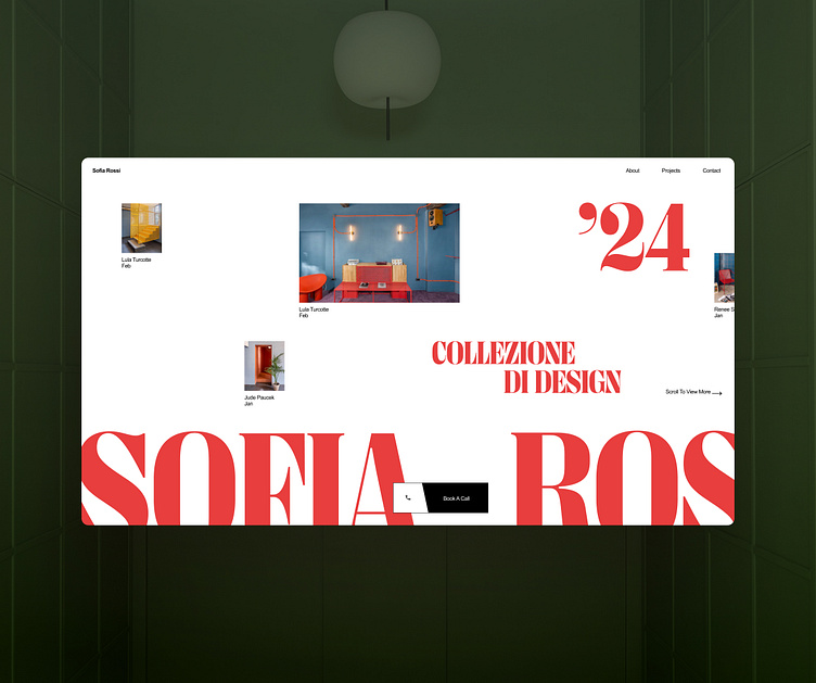
Architecture website concept
For this concept I used a similar approach but mixed the hierarchy of elements a little bit. The year number got bigger to mark the importance of the current projects.
We can use strategies like the currency bias to our advantage and increase our conversion. The psychology of it is basically people will rely heavily on what has just happened to favor certain outcomes. In sport betting for example, betters will follow a team on losing/winning streak regardless of the season at large.
In our projects, we can shift the focus and sometimes put it on some elements that say different things. Here the Year 2024 being highlighted says "hey look at all the clients we've helped this year! We're killing it!", which will reassure customers we are super active and ready to help them. It works similarly to social proofs.
Conclusion, these details are not just cosmetic, they're functional choices that can drive conversion📈🌟
