B TEN - Brand Identity Design
B TEN - Logo Concept
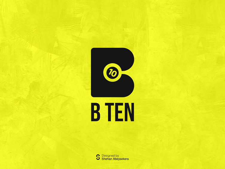
This logo I made combines a letter "B" with a snooker ball to show it's for a snooker club. The "B" is designed maintaining negative space. Inside the letter, there's a snooker ball with the number 10 on it, showing it's a snooker place. The design makes it look like the ball is moving inside the letter "B," giving it a lively feel. It's a clever way to show what the club is about and makes the logo interesting to look at.
Use of Golden Ratio
Brand Application Designs
More by Shehan Abeysekera View profile
Like


