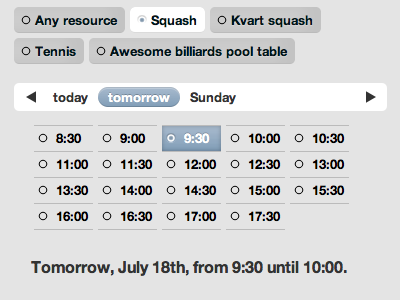
Small-screen booking interface
A bit much right now. I need “Any resource” to stand out a bit. The day picker also needs a looking glass icon still, but that’s pixels.
All CSS except for the styled checkmark/radio button hybrid.
More by Rob Mientjes View profile
Like
