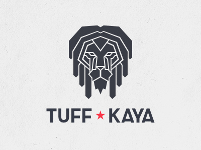
Tuff Kaya logo - fixed
I wasn't happy at all with this one, something about the eyes was bothering me. A friend suggested me to join the nose and the eyes in a single shape, and he nailed it. Also, the stroke is wider and irregular. It was so thin it didn't look well in smaller versions.
Made with Affinity Designer.
More by Ros View profile
Like
