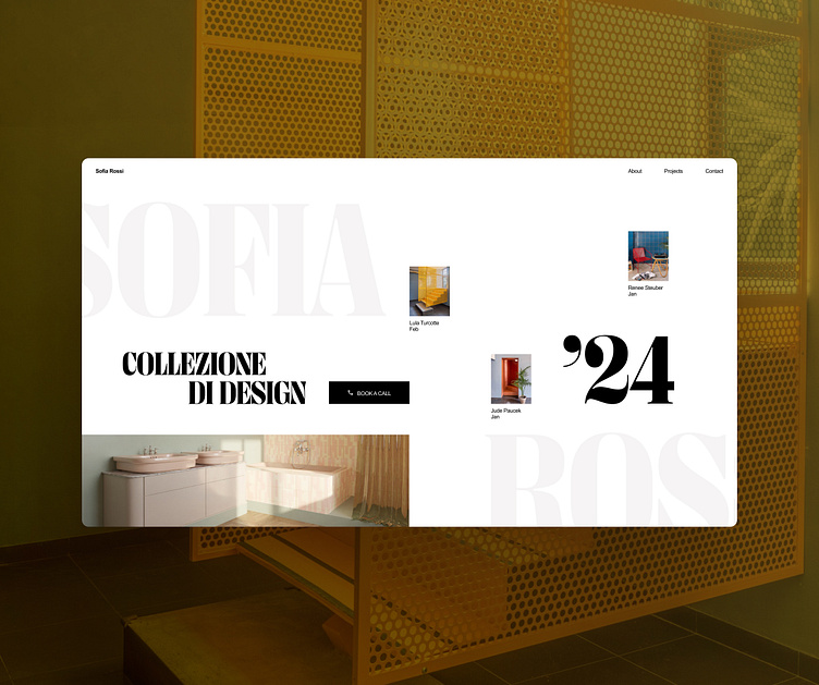
Architecture studio website concept for a Rome based studio
Second in the series. In this one, I use the large typeface as a texture more than a focal point, so that users can primarily see the main information first. The Collezione Di Design, the projects images and the main CTA to call the studio.
📧 Got a project idea? Send me a DM to connect 📧 Instagram
More by Quentin Caron View profile
Like
