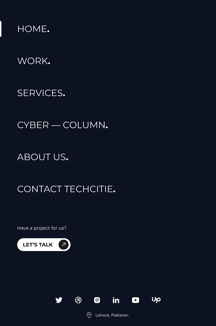
WEBSITE—NAVIGATION
Through a meticulous design process using Figma, I have developed a bespoke navigation system for our tech agency's website. Beginning with a thorough analysis of user needs and website goals, I crafted wireframes to outline the structure and functionality of the navigation. With a focus on simplicity and clarity, I iteratively refined the design, ensuring each element served a purpose and contributed to a seamless user experience.
Drawing inspiration from modern design principles, I employed clean lines, ample whitespace, and intuitive iconography to create a visually engaging yet minimalist navigation interface. Leveraging Figma's powerful features, I meticulously crafted each component, from dropdown menus to interactive hover effects, ensuring consistency across all devices and screen sizes.
The result is a navigation system that not only guides users effortlessly through our website but also reflects our agency's commitment to innovation and user-centric design. With its clean and minimalist aesthetic, our navigation sets the tone for the entire browsing experience, reinforcing our brand identity and positioning us as leaders in the digital landscape.

