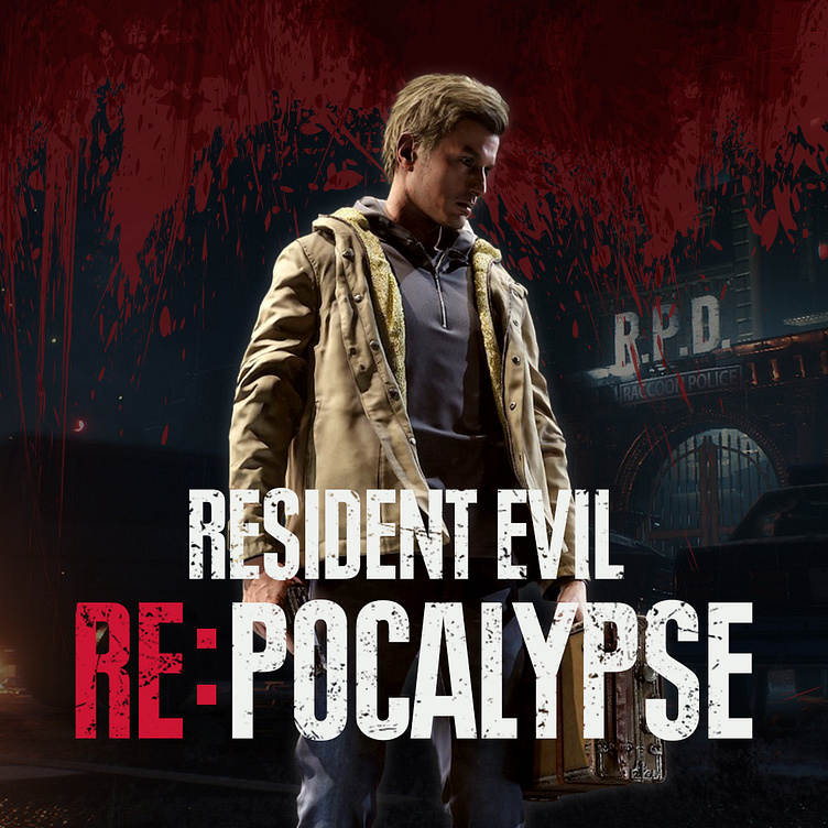
User Interface Design: Resident Evil
://TLDR
Role: UI/UX Designer
Software Used: Figma, Adobe Photoshop, Adobe Illustrator
Duration: 8 Weeks
Solo project
Challenges
First major UX/UI project
Translating the Mincraft Dungeons framework into a Resident Evil aesthetic.
Designing with a focus on best accessibility practices
This case study asks the question, "What if there was a Resident Evil ARPG (Action Role-Playing Game) in the vein of Diablo or Path of Exile?" I used Minecraft Dungeons as a base and explored ways to improve the user experience while changing the interface to fit the Resident Evil aesthetic.
UXing It Up In Here
This project marks my first major effort as a UX/UI designer and also my first design project with Figma. Through it all, I learned the process of a UX designer beginning with creating player profiles, user journey, paper prototypes, usability testing, and wireframes.
Player Journey
To create my player journey, I watched YouTuber, ZackScottGames, and based my evaluations off of his experience. You can watch his gameplay here: https://youtu.be/Y-YaC5M4ois.
From his gameplay I observed the following:
Main gameplay loop is solid and not in need of major change
Opportunities to improve player experience through improved mission select screen and inventory screen
Flowchart
With the player journey complete and thoughts in mind on how I could improve the journey for my target users, I created a paper prototype which outlines the potential player choices with each paper being its own screen. I then built out a flowchart to more thoroughly test the ideas I developed. I looked to explore all of the possible options a player would have in Minecraft Dungeons to see if their are any areas were the player experience could be improved.
Added a new "Difficulty Selection" screen
Moved objective information from Game HUD to Map Screen
Wireframes
Based off of choices made in the flowchart, I created wireframes for four screens, title, main game, map, and inventory.
UI Party Time!
To create the user interface, I first researched other Resident Evil titles to get an understanding of what makes a user interface feel at home in Resident Evil regardless of genre. After recreating and experimenting a bit with some assets, I created a style guide which was then used to build the high-fidelity mock-ups.
Style Guide
The purpose of the style guide is to outline the rules of the RE:pocalypse design language so the look and feel of UI designs will remain consistent over time and between multiple designers.
High-Fidelity Mock-ups
Tools used: Adobe Photoshop and Illustrator
Designed to be fully scalable up or down with no loss of fidelity
Color-blind Testing
To help ensure this game could be enjoyed by someone color-blind I tested using a tool which simulates various kinds of color-blindness. Below are the screens for my test of functionality for someone with protanopia. The general logic of designing for color-blind accessibility is to never have color be the only visual cue of important information, but to also include things like shape or text which read the same regardless of color.


