Daily UI challenge 003: Landing page
Hey there! It's time for the third daily UI challenge: Designing a landing page.
Alright, so first things first... I had to double-check if I really knew the difference between a landing page and a homepage.
I have found this awesome article called Landing Page vs Home Page: Key Differences Explained (apexure.com).
It says that landing pages are all about getting people to do something, like signing up or making a purchase. They've got one main thing they want you to do, no distractions, and you can have as many as you need for different purposes.
Homepages, on the other hand, are more about showing off the brand and welcoming visitors. It's like the friendly face of the website, saying hi to everyone who stops by.
Now, the thing that caught my attention and what I learned from this article are the main differences in goals of a landing and a homepage.
When it comes to landing pages, their main goal is: "Conversions. Plain and simple." So, they typically feature just one clear Call to Action (CTA), and when it comes to external links, they usually keep it simple with none at all. But here's the thing: not everyone is the same, that's why landing pages aren't one-size-fits-all. They're about understanding your audience and giving them exactly what they're looking for.
However, the goal of a homepage is: "Inspire exploration." Since it's more about spreading brand awareness, homepages might have multiple CTAs and several external links. That's why the target audience of a homepage is broad, welcoming all visitors who land on the main page of a website.
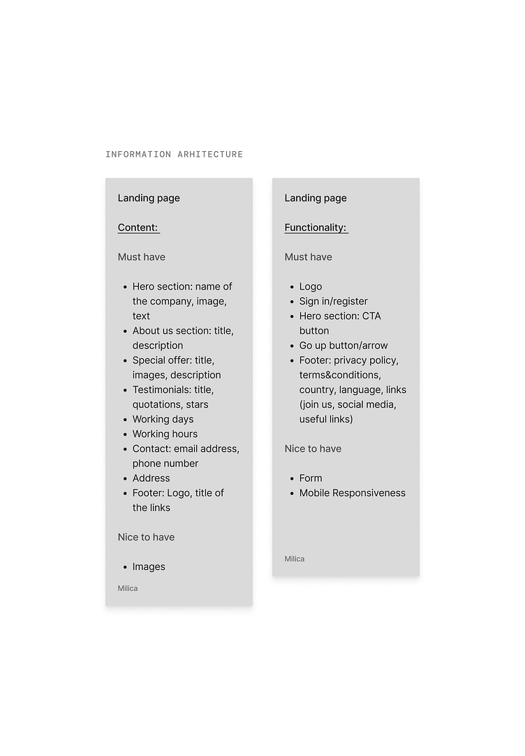
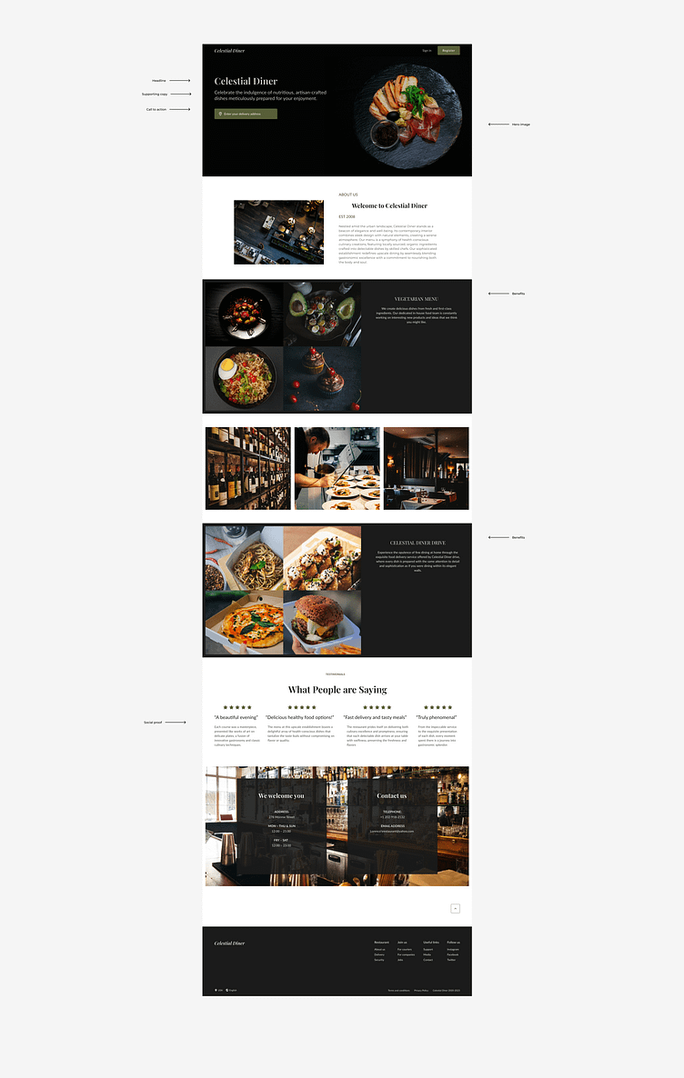
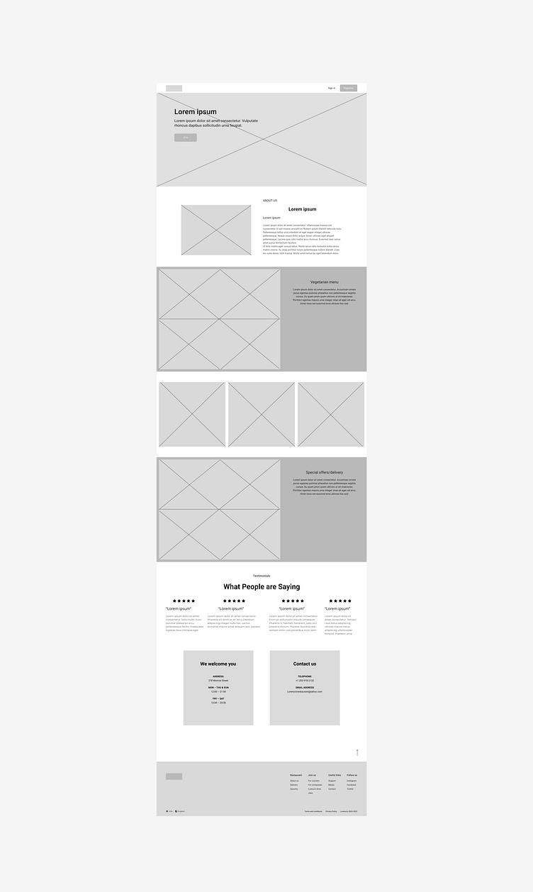
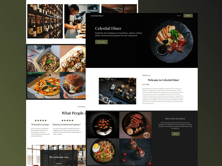
Having read this article, I tried my best to design a landing page for a fancy restaurant that offers delivery to their busy customers.