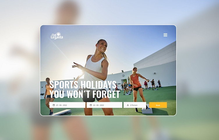
Website design for premier sports resort UI UX
website proposal for a premiere sports hotel and resort in the Canary Islands.
Project Goals
Enhanced user experience: streamline the website's information architecture.
Reduce Information Overload: Eliminate excessive text
Modernise the design: While adhering to the existing brand guide.
Process:
1. Research & analysis: To understand the pain points of the existing website and the needs of Club La Santa's target audience. Identified the following issues:
Overwhelming Text - made it difficult for users to find relevant information.
Complex Navigation - that lacked clarity, making it challenging for users to find the information they were interested in.
2. User Journey Mapping: Visualised user paths to identify key touch-points and pain points. Simplified the journey through improved navigation, clear calls to action, and optimised information flow.
3. Visual Identity: Adopted a minimalistic and clean design to align with Club La Santa's Scandinavian roots, moving away from bright colour-blocked backgrounds.
4. Information Architecture: Streamlined the homepage structure, categorising activities, accommodations, and services into easily accessible sections, with concise text and the option to read more. Utilised parallax images to create a dynamic walkthrough for essential information.
Prototyping & Testing
The feedback received was largely positive, with users finding the new design more user-friendly and visually appealing.
Conclusion
While the proposed design was not chosen in the end, it served as a valuable experience. This project reinforced the importance of user-centric design to improve the user journey for a complex website.
