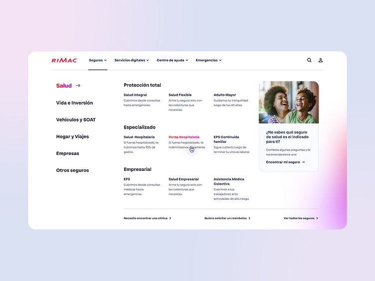
Menu redesign for an Assurance brand - Web design
The redesign of the menu for the insurance company focused on reorganizing the information architecture to enhance the visibility of existing items, which were previously concealed.
By restructuring the menu, key items are now more prominently displayed, ensuring easier access and navigation for users.
This redesign aims to streamline the user experience, making essential services and options readily available, thereby improving overall usability and efficiency.
More by Mario Luna Meza View profile
Like
