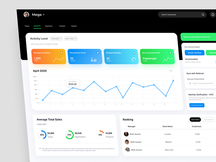
Analysis Dashboard Design
Hey People,
Dashboard Design Exploration For Design Tent - Analysis Dashboard Design
Available For New Project
So feel free to contact me at : 📩 farukupbdt@gmail.com
Follow us on:
Instagram | LinkedIn | Behance | Twitter
Check out the website https://linktr.ee/omarfarukuiux
Analysis Dashboard Design > Purpose
Designing an analysis dashboard involves several considerations to ensure it effectively presents data and insights to users. Here's a detailed guide on how to design an analysis dashboard:
Define Purpose and Audience:
Understand the primary purpose of the dashboard. Is it for monitoring, decision-making, or exploratory analysis?
Identify the target audience and their needs. What information are they seeking? What actions might they take based on the insights provided?
Select Key Metrics and KPIs:
Determine the most critical metrics and key performance indicators (KPIs) relevant to the audience and purpose.
Ensure that these metrics align with organizational goals and objectives.
Choose Visualization Techniques:
Select appropriate visualization techniques based on the nature of the data and the insights to be conveyed.
Common visualization types include bar charts, line graphs, pie charts, scatter plots, heatmaps, and tables.
Use color, size, shape, and other visual cues effectively to highlight key insights and trends.
Organize Layout and Structure:
Design a clean and intuitive layout that guides users' attention to the most critical information.
Group related metrics and visualizations logically to facilitate easy comprehension.
Prioritize important information and place it prominently on the dashboard.
Provide Interactivity and Drill-Down Options:
Incorporate interactive elements such as filters, dropdowns, sliders, and buttons to allow users to customize their view.
Enable drill-down functionality to explore detailed information at lower levels of granularity.
Ensure Responsiveness and Compatibility:
Design the dashboard to be responsive across different devices and screen sizes.
Test compatibility with various web browsers and ensure consistent performance.
Maintain Consistency and Clarity:
Use consistent formatting, labeling, and terminology throughout the dashboard.
Avoid clutter and unnecessary distractions that could confuse users.
Provide clear titles, captions, and annotations to explain the context and meaning of the data.
Include Contextual Information:
Provide contextual information such as trends over time, benchmarks, targets, and comparisons with historical data or industry standards.
Use annotations, callouts, and annotations to highlight important events or insights.
Consider Accessibility and Usability:
Ensure that the dashboard is accessible to users with disabilities by following accessibility standards such as WCAG (Web Content Accessibility Guidelines).
Use high contrast colors, readable fonts, and appropriate font sizes to enhance usability for all users.
Iterate and Gather Feedback:
Iterate on the design based on feedback from stakeholders and end-users.
Conduct usability testing to identify any usability issues and areas for improvement.
Monitor Performance and Usage:
Implement tracking mechanisms to monitor how users interact with the dashboard.
Analyze usage patterns and user feedback to continually refine and optimize the dashboard over time.


