Wayy 2 - A simple transportation app
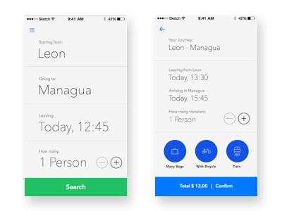
After some iteration on this public transportation app for LATAM cities, I've added even more context and pre-selected as many choices as possible:
- Your starting location is already pre-selected (in most LATAM cities, the main station for a longer journey is usually the city station).
- Your recently reserved / booked destination is already pre-selected.
- All selected filters are clearly visible before booking
- You can easily add more people to the reservation, without changing context.
Leading user interviews and observing the behavior, the basic UX remained the same:
- In many situations, the user is holding their phone in a moving situation (walking to the station, packing your bag, leaving one place and looking for direction to another place).
- User might be in a rush and need a solution immediately.
- All options need to be in reach immediately.
Working from this context, I've designed Wayy with bold buttons, big labels, big input fields and removing as much clutter as possible.


