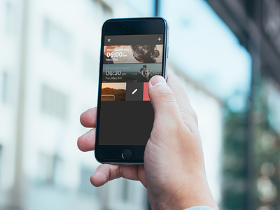
Pancake second app preview
After designed a beta version, i got an issue with brightness. Indeed, massive white background wouldn't be the best choose. Regarding my alpha version we can agree the brightness is not as important as the previous version. Plus that darker background allow me to play with opacity on list when the alarm is switch off. Which is much more pleasant for eyes. Pancake will allow users to receive invitation to share programmed alarm and I hated how big pop-up notifications on the beta version. So I added a new button at the top of the app and I opted for a very slight notification as you can see in the last version below, the button will show up green when users got requests. No numbers, just a simple color. If you have feedbacks about design, please i would love to read them.
Here we are, It's time to develop Pancake. Thanks Meng To and his awesome book Design+Code. Which help so much to learn and understand how to develop application by myself.
You can follow the project on Twitter and like the Facebook page.
Rudy with love


