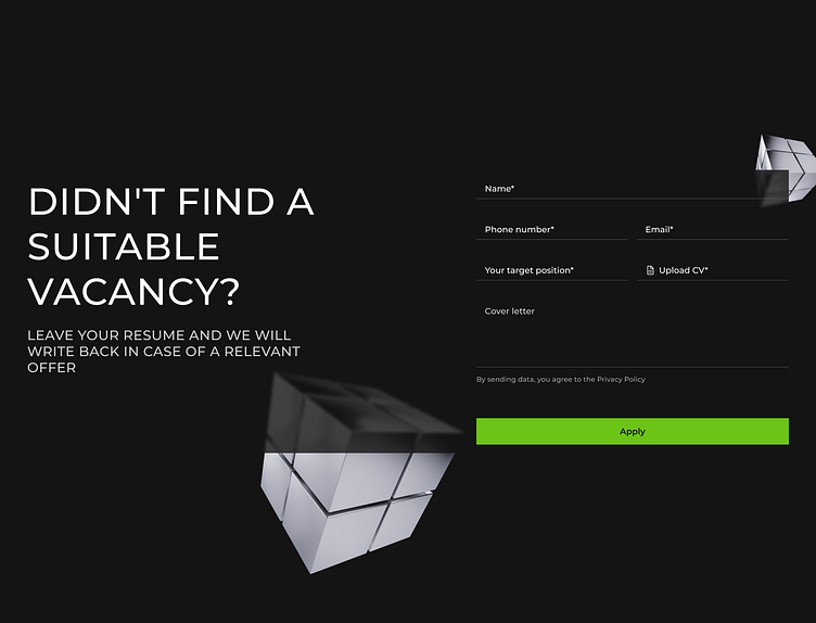
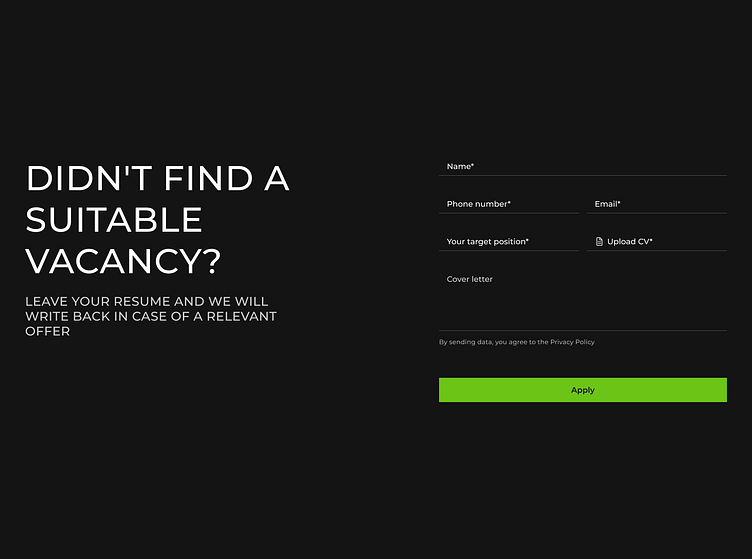
Contact form of applying for the vacancy
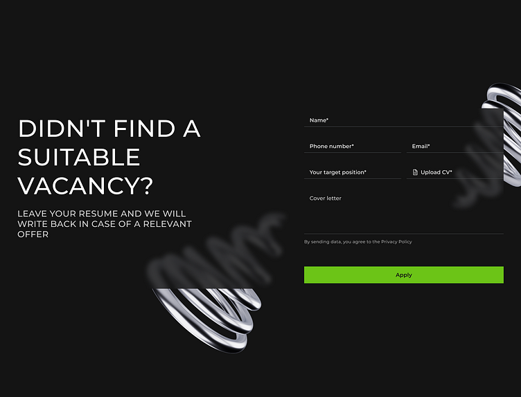
The question of today is: is it better to minimalistic form here or add 3D elements?
The main advantage of first variant - nothing distracts the user's attention from the main goal (fill in the form).
On the other hand, the second option allows to add depth to the element.
What's your opinion on this? Share it in comments ;-)