Sound Incorporated - Logo Refresh Concept
When we began this logo refresh project, we were given a couple of parameters: we needed to retain the color palette, and we needed to retain the bars/waves.
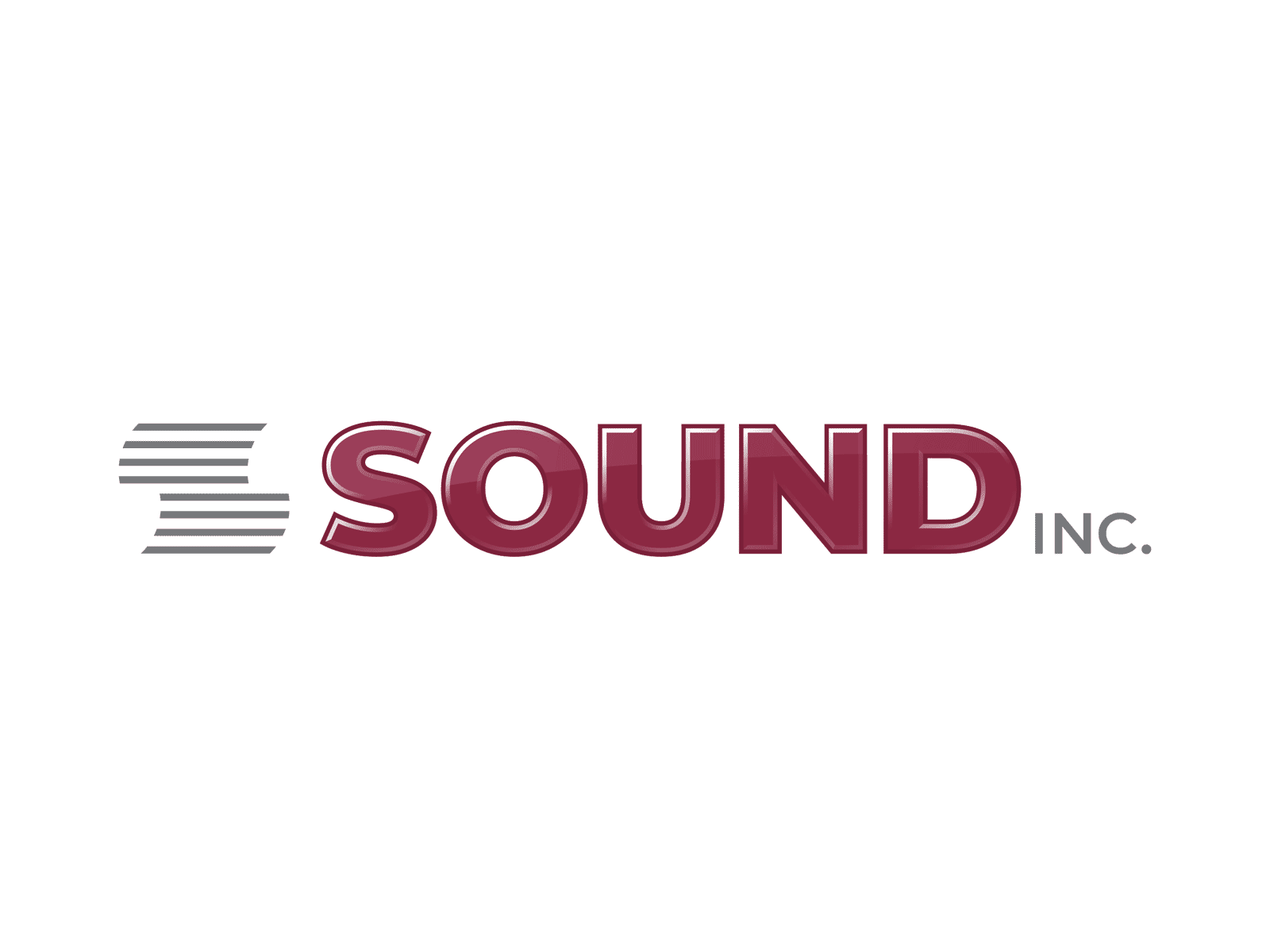
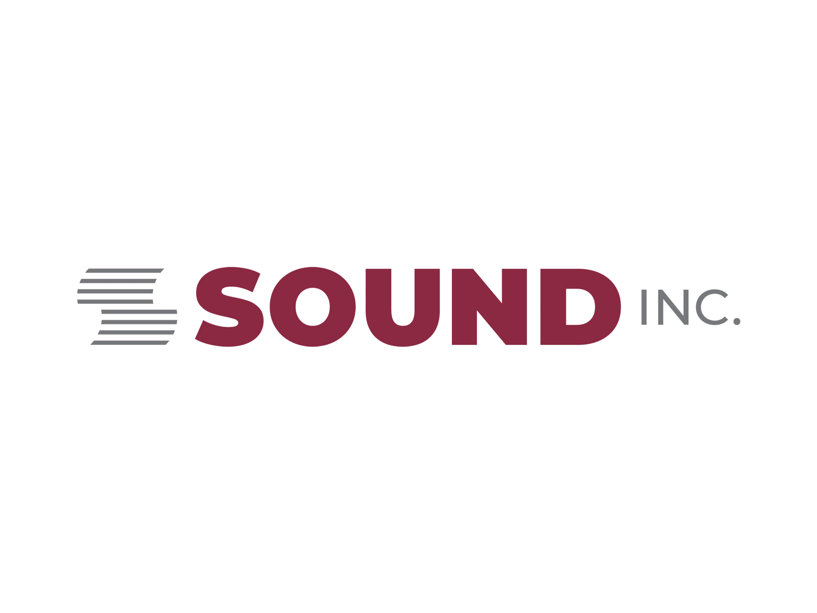
This particular concept is a version 2 of a couple different concepts that the client really liked... they responded well to the gray lines mark, and they really liked the strength and boldness of the "SOUND" logotype, and also liked the contrast in font size between SOUND and INC.
I pushed this a bit further, per the client's request, to apply a 3D glossy treatment to the SOUND logotype.
Here is the previous version:
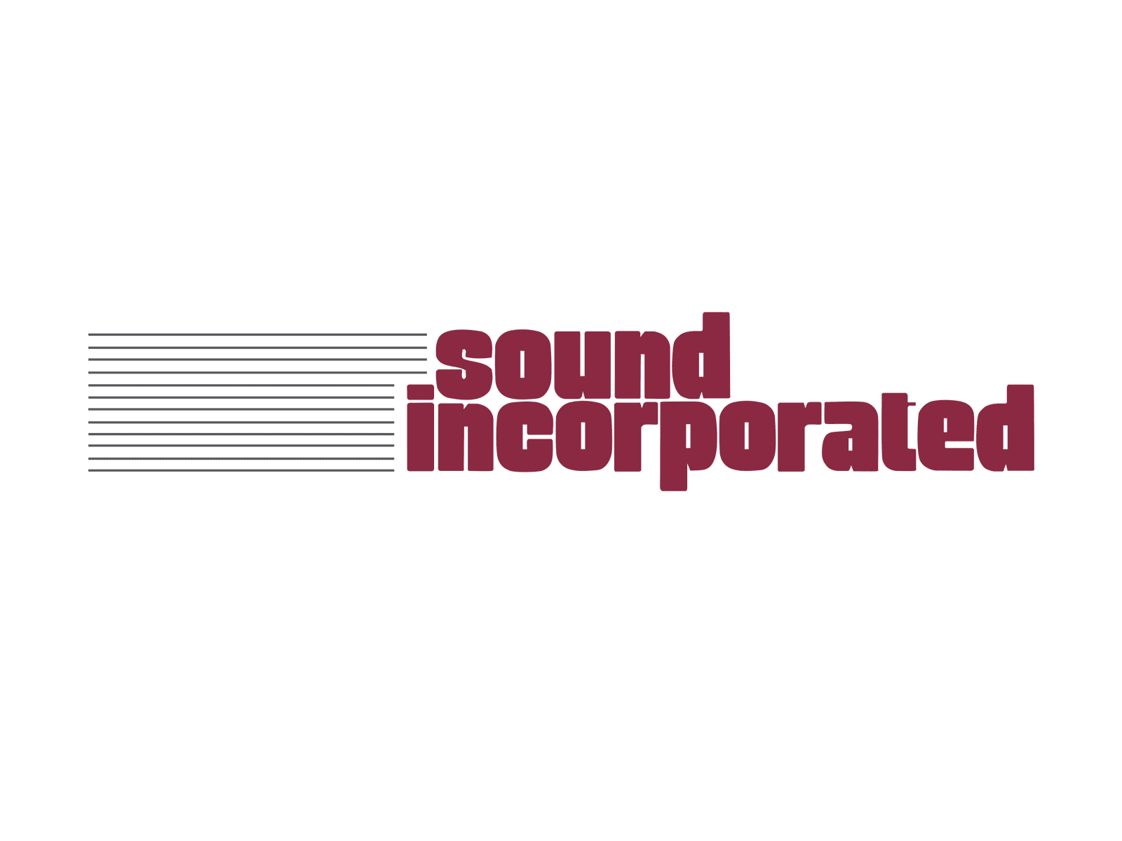
Below, is the original logo for comparison purposes:
More by Orbit Media Studios View profile
Like


