Relating Time & Energy

Life's too short to be running slow!
Story
In cases where intrinsic motivation can be lacking as is the case with any training program, I work well with systems. At the risk of suggesting I am actually a replicant, viewing quantifiable metrics has always helped me stay on track. I suspect i'am not in the minority.
So my goal was to incorporate a bare minimum workout regimen that can help maintain a sustainable health.
And one way for me to assess that is how good I am at sprinting. Because it requires a concert of agility, muscle tone, core strength, cardiovascular health, sphincter control and what not.
I really wanted to just track data, but guess one could improve what one has decided to measure.
Considerations
Can't spend more than 1hr/day
Not trying to be an athlete
Only doing 4-5km runs for now
Work towards >50% in VO2 range
Target all muscle groups by working out in splits
Focus on augmenting running using training
Seamless means to log relevant data
And use this data to see where time really goes


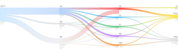
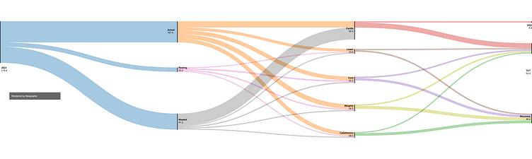
Pulling Insights
As seen most of the training data is obvious for consistency by just looking at records, but drain of time not so much, until visualised.
Under Tension : 2.5 days focused training
Needed 7 days of work to get there
Mere 3% relevant.
This inspite of sticking to a program
Making it clear that planning still only has 50% efficiency at best
I could save nearly 3 days each year, if I lived next to a track, haha
So roughly 12 days per year dedicated for training
Which means if I somehow live till 90, that's about 600 days
Nearly 2 years of maintenance for every 50yrs of life
Or 1 yr for every 25 yrs, which sounds ok
But imagine working out 1 whole year
Human body is fuckin inefficient
~21% of actual cardio was in Vo2 range
Which is quite horrible
As my best runs have had >50% Vo2
Muscle strength needed for faster paces
And I'm still trying to crack the 1hr mark, will get there soon
Sure there is overall health benefits from consistency, but there's definite room for improvement. Biggest culprit being time lost to and from running track. Which I don't mind as I get to be outside. And it has been shown to improve overall mental health. But in general there is a mix of planning exercises better and being more time aware should help reduce time loss. Given I know where there is a drain.
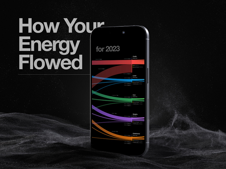
Data In Motion
I've never shunned from animating inanimate objects, only way to conquer my inner cynicism. JK, I think it helps direct attention better. Also bane of every designers brain.
Song Credit : Memento by Katu
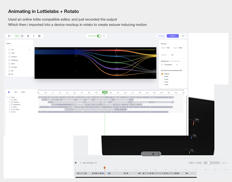
A gratuitous, overtly self indulgent animation was made using Lottielabs & Rotato, some screen recording and compression jiu jitsu. I've stopped using After Effects, and dear lord this would be so much easier in code.
. . .
Some Explorations
As a concept I tried to place this format in different contexts to visualise how it could potentially be used. What I love the most is my design both elevates and levitates devices.


+Older exploration
A few year ago, I had experimented with developing a holistic health tracking concept. Where rest, diet were also a part of it. And goal tracking being the main feature. Along the same lines of dataviz.
I continue to believe minimal storytelling without pandering to its audience, and making complex data more accessible is the way for habit forming applications to be relevant.
...
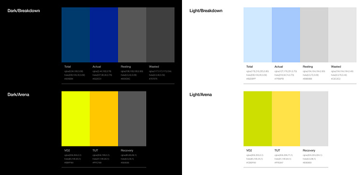
Exercise In Colours
Mainly ended up implementing the design for dark mode.
Tried developing a palette for both modes, consistent with my logging style.
The type colours worked.
And on the surface other colours seem adaptable to both modes too.
Except when seen for contrast, highlights didn't translate as well as I'd hoped.
Did I have to do this exercise? No! but I use notion in both modes lol.
So with corrections, only the breakdown and arena groups needed change to match the contrast pattern.
FYI the luminance gradients exist, because I am using alpha channels for transparency, helps reduce setting color gradient in file.
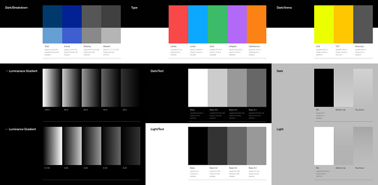

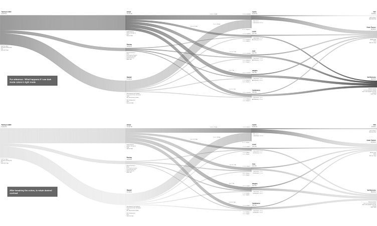


I still think it needs work, oh well
...
Crunching Numbers
I had all this data, but needed a way to clearly visualise its relation to time. Keeping in mind the goal to make logging as simple as how one maintains training diaries. But to just do it on phone.
Simplified Logging
Start & End
Total time box : everything is blocked in advance.
An automation button, to log actual start and end.
HR using smart watch, so that's already intuitive
What automatically gets tracked by entry logs
Actual session : from first set entry to last (includes resting)
Resting : by calculating between each exercise bout
Wasted : basic subtraction from total logged minus above two
More Training info
All cardio data : VO2, HR, max pace, distance, duration using fitness band
Each set : reps and time under tension in seconds
Fyi I make a mental note looking at clock, then log after set ends
A multimodal AI doing this for me would be a blessing

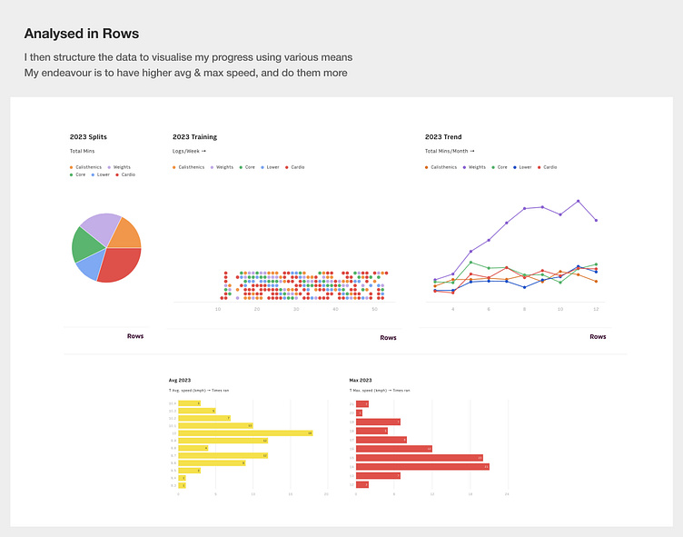

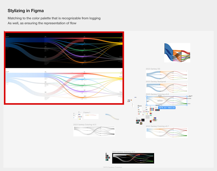
Data to Visualisation workflow
Notion : log data using automations + templates
training logs tables → databases, markdowns
Rows : integrate with notion, in excel like format + customisation of data
db blocks → csv
RAWGraphs : use custom csv to render data viz
csv →
svg
Figma : edit svg to stylise, and make final render
svg → jpg
Animation : Currently using lottielabs, plan to use native svg/script animation
svg → json/mp4
Ongoing Endeavour
And if I get through this year without killing myself, I'll make the whole animation in D3.js and embed it directly in my dashboard. At which point sharing Notion pages publicly might be a good idea.
Meanwhile realtime progress here → Strava Link

. . .
