Daily UI Challenge: Day 5 (Data Visualization)
Hey Dribbblers!
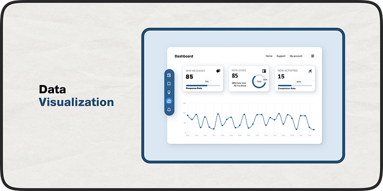
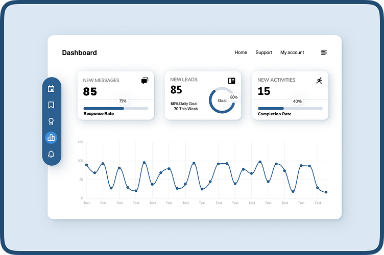
Today's challenge tackles data visualization! Here's a fictional dashboard design exploring alternative chart types for a clearer user experience.
Key features:
Rounder bar graph: Provides a softer visual approach while maintaining comparison capabilities.
Line chart: Effectively highlights trends and relationships within the data.
Doughnut chart: Showcases the composition of a whole in a visually engaging way.
What do you think?
Would this dashboard make data exploration more intuitive for a wider audience?
Let me know in the comments!
P.S. This is a fictional design for UI Design Challenge Day 5.
Feel free to follow my work for more design explorations:
Looking forward to connecting!
Thanks for taking the time to read!
#ui #design #userexperience #data #datavisualization #dashboard #dailyui #uichallenge #dribbble
