Onboarding
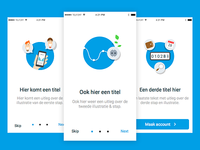
Unused onboarding screens for a service app.
When we tested we found out that when we used actual interface elements of the app it was a lot clearer for the users when they saw the specific screens later on. We then used similar illustrations later on in message screens where they had a clearer purpose.
More by Tim Dekens View profile
Like


