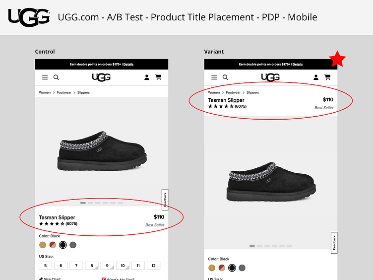
UGG.com | A/B Test | Product Title Placement | PDP
Problem: The new 4:5 product image ratio pushes the calls to action (selectors & add to cart button) further down the page. In session replays, users were observed having to scroll up and down to see product images when selecting new color swatches.
Hypothesis: If we place the product title section above the product image on mobile devices, then user paint points will be alleviated and the add to cart button will be closer to the product image, which will increase cart rate.
Primary KPI: Add to Cart Rate
Secondary KPI: Conversion Rate
Results: The variant won with +x.x% uplift.
More by Kate Meyer View profile
Like
