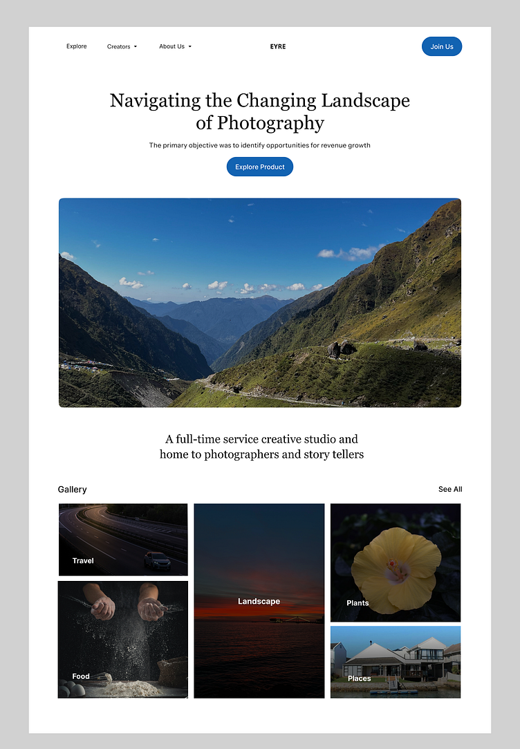
Exploration for a photography Homepage
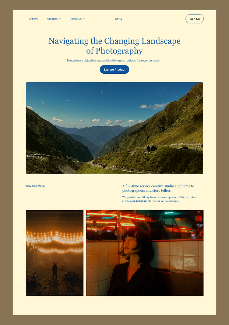
Exploration Two.
I changed the colors of the page and text, since it is a photographer's page, i wanted it to have this earthly combo that is why I opted for these tones. I also changed the layout of the page. :)
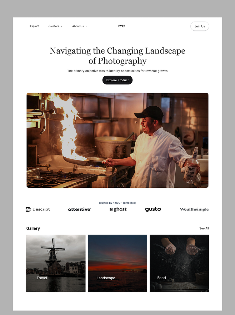
Exploration Three
I did a black and white background with this exploration. I added social proof to make it more trustworthy and speed up the conversion process.
Which of this design resonates with you best?
If you want to design, or redesign your website, shoot me a dm - juddblck2@gmail.com
