OCHAYA
Branding identity for Ochaya (meaning 'teahouse'), a matcha specialty brand that offers a wide range of premium matcha.
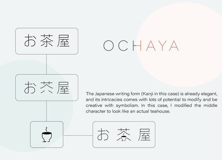
My primary focus was to create a branding that reflects the serene feeling of drinking tea, authenticity, and minimalism. The Japanese writing form (Kanji in this case) is already elegant, and its intricacies come with lots of potential to modify and be creative with symbolism. In this case, I modified the middle character to look like an actual teahouse.